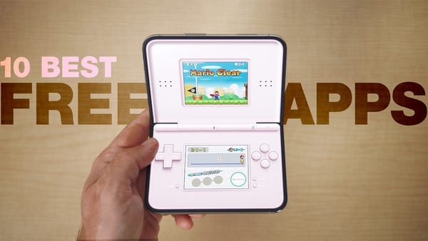
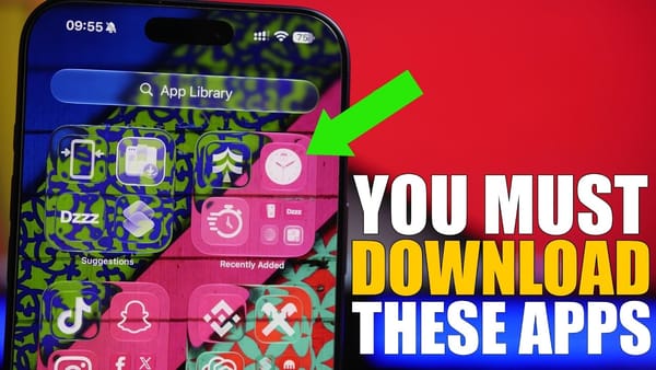
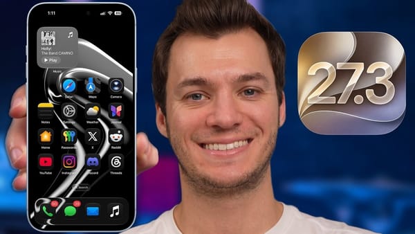
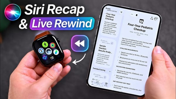
Close the iPhone Duo and Deck-Man starts its virtual cassette, one example in 9to5Mac's app tour that distinguishes software that merely expands from software that gives the hinge a job. Its examples include games with separate play areas, a card binder and browser windows that imitate a small desktop.
When the fold changes the interaction
- Deck-Man. The cassette player loads an album and starts playback when the phone closes. In the demonstration, repeatedly fast-forwarding and rewinding can tangle the virtual tape, which then needs winding back into place.
- Battlefleet Duo. A partial fold separates the radar from the player's ships. The channel demonstrates playing against the computer and switching views, making the two areas useful rather than decorative.
- Delta and Penalty Area. Delta gives Nintendo DS games a familiar two-part arrangement. Penalty Area instead asks the player to place the phone in a laptop-like position before shooting at a goalkeeper. These are different reasons to keep the hinge partly open.
- Route 25 and PEX. Route 25 presents a Pokémon card collection as a binder that opens with the device. PEX uses the same physical idea for a Pokédex and demonstrates scanning a card into its collection.
When the larger workspace matters
- InfiniteX2P Pro. The channel opens browser windows, a calculator and other tools inside a desktop-style interface. It discusses a Bluetooth keyboard and mouse, but the external-display example is mirroring, rather than a claim of independent extended-screen support.
- Zillow and IKEA. The tour shows housing photos beside listing details and room to browse furniture. The advantage here is seeing related information together without constantly changing screens.
- Sideline and NBA. Sports layouts use the extra space for scores, schedules and player information. 9to5Mac highlights reachable controls as part of adaptation, beyond simply making content larger.
- Netflix and Prime Video. Both have adapted layouts in the footage. Disney+ remains the counterexample: much of the inner screen is occupied, yet navigation still requires reaching across to controls on the opposite side.
That navigation distinction is the useful takeaway for iPhoners evaluating their own apps. The channel separates unadapted layouts, expanded iPad-like layouts and interfaces that account for how the folded and open phone are held. Its upload-day examples can change with later updates.
A hinge-aware game and one everyday app would be my starting point. Together they'd tell me whether the fold adds an interaction I want or just a larger view of the same task.