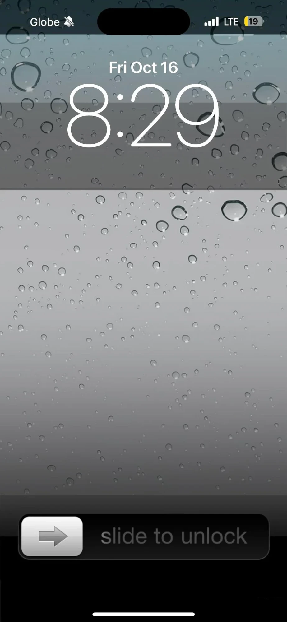
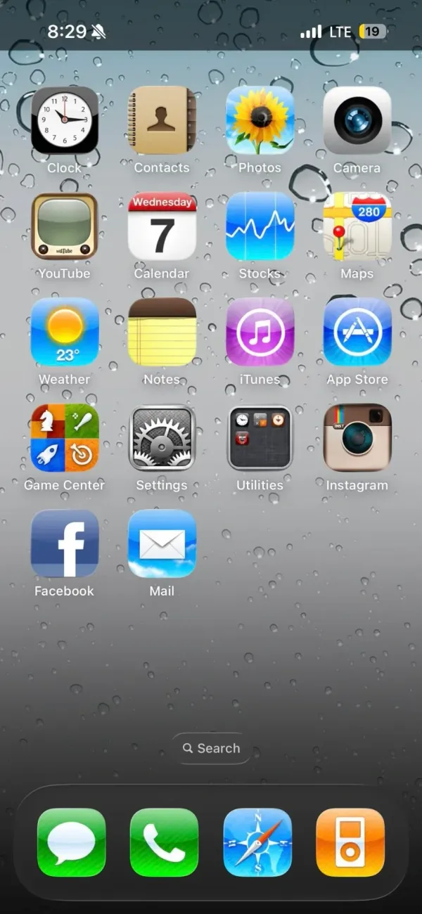
Glossy icons, a leather-bound Contacts book, grey glass covered in water drops. This is the iPhone from before iOS 7 flattened everything, rebuilt by a nostalgia-first iPhoner on a phone with a Dynamic Island. Only a few modern details give it away.
The same water drop wallpaper runs from the Lock Screen to the Home Screen, so the two read as one surface. Up top the Lock Screen keeps the outlined modern clock and date. The bottom carries the old slider bar, grey arrow knob and all. The Home Screen is a single page of 18 labeled icons in a four-column grid, the last row half full, with no widgets and iOS's own Search pill floating above the dock.
The icon set is Apple's apps as they looked then. Clock has the black-rimmed face, Calendar its red header, Photos the sunflower, Maps the 280 highway shield, Notes a yellow legal pad, iTunes a purple disc, Game Center the four-tile felt, and Settings a block of gears. YouTube gets the tan TV set, and the third-party apps play along with Instagram's brown camera and the old Facebook square. A Utilities folder shows its mini icons in the old dark grid. The dock holds Messages, Phone, Safari's compass, and an orange iPod.
One tell: the Calendar icon is stuck on Wednesday 7 while the Lock Screen reads Friday, October 16, so these are custom icons, not Apple's live ones. Where the iOS 6 revival home screen leaned on an iPod widget, this one skips widgets entirely, and iPhoners copying it trade live dates and badges for the texture.
A nostalgic iPhoner brings back iOS 4, water drops and all
Skeuomorphic icons down to a yellow legal pad for Notes and an orange iPod in the dock sit on that old grey glass, all on a phone with a Dynamic Island.
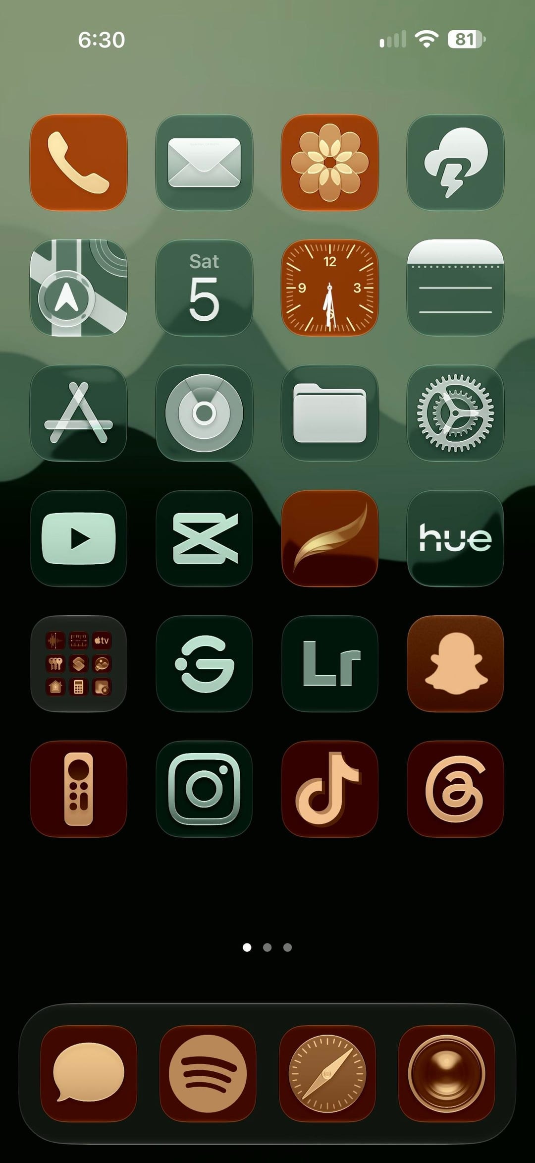
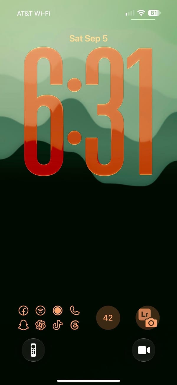
Two colors do all the work here: every icon on the Home Screen is either forest green with a pale mint glyph or terracotta with a cream one, on a mountain-ridge gradient from sage to black, and the Lock Screen answers with the same ridge and a clock stretched to a third of the screen in an orange-to-red gradient. It reads as a creative iPhoner's phone: Lightroom and CapCut on the first page, a Lightroom camera shortcut on the Lock Screen.
The wallpaper carries from Lock Screen to Home Screen without a blur. The Lock Screen uses iOS 26's resizable clock, pulled tall and tinted peach to red, with the widgets moved to the bottom edge: a launcher tile of eight outlined app glyphs, a round counter, and the Lightroom camera button, and the two quick-action buttons swapped for the Apple TV remote and video. The Home Screen is a full six-row grid with no labels and no widgets, three pages deep, over a dock of four terracotta tiles.
The green tiles hold the utilities: Mail, Weather, Maps, Calendar, Notes, App Store, Files, Settings, YouTube, CapCut, Hue, Instagram, and Lightroom. The terracotta tiles hold the social and creative half: Phone, Photos, Clock, a brush-stroke app, Snapchat, the Apple TV remote, TikTok, and Threads, with Messages, Spotify, Safari, and Camera in the dock. A folder of stock apps sits in the fifth row, next to two green tiles: a ring with a dot, and a G in a circle.
The recipe is a two-color icon set with every glyph in the same pale tint; the wallpaper does the rest, and the clock color is a slider in the iOS 26 Lock Screen editor. It suits an iPhoner who wants a dark phone without a black one, and the terracotta keeps it from going gloomy.
Forest green and clay icons under a stretched glass clock
A creative iPhoner's two-tone setup, where every icon is either forest green or terracotta and the iOS 26 clock stretches into an orange-to-red gradient.
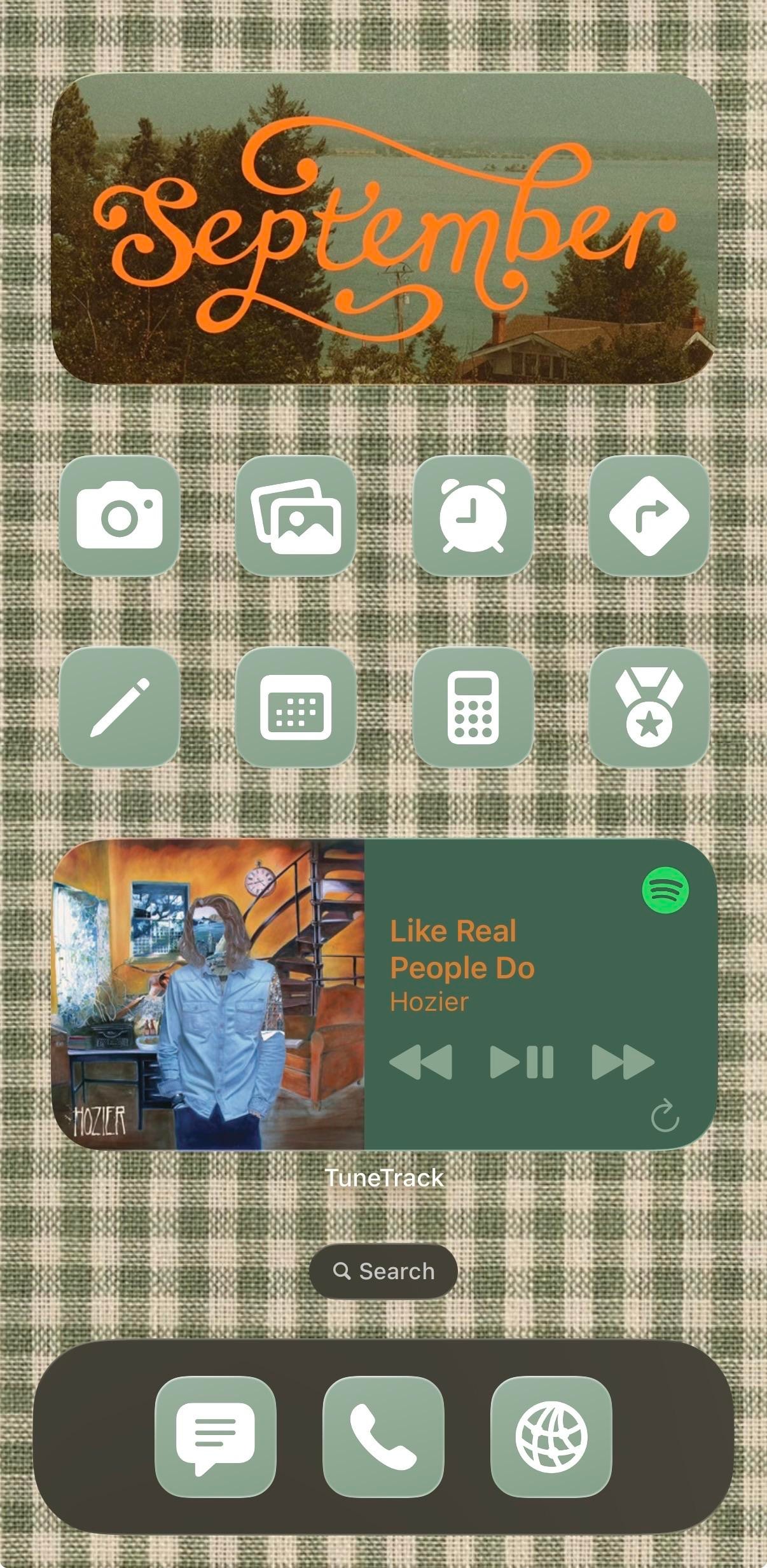
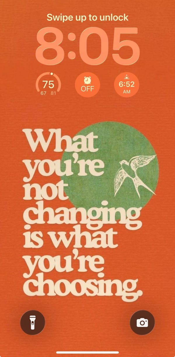
This phone has already decided it's autumn. The Lock Screen is a burnt-orange poster with a white swallow over a green circle and chunky retro serif reading "What you're not changing is what you're choosing," and the Home Screen answers it in sage-and-cream gingham, topped by a photo widget with September written across it in orange script. It belongs to a music-first iPhoner: the wallpapers don't match, the colors do.
The poster's green circle is the same sage as the icon tiles, and its cream lettering comes back in the gingham. Same three colors, two surfaces. Under the peach rounded clock sit three stock circle widgets for temperature, the next alarm, and sunrise. The Home Screen is one page: the medium photo widget with its faded lakeside shot, two rows of four icons, a medium now-playing card, and a dark olive dock. Every icon is the same sage square with a white glyph and no label. The grid reads as one block of color.
Five glyphs map to stock apps (camera, photo stack, alarm clock, calendar, calculator); the other three are a pencil, a turn arrow in a diamond, and a medal with a star. The centerpiece is TuneTrack, a third-party widget that mirrors Spotify's now-playing, and it's the only thing on the page that keeps its label. Hozier's "Like Real People Do" is on it, which suits the gingham a little too well. The dock holds a message bubble, a phone handset, and a globe in the same sage tiles.
Copying it costs a gingham image and a one-color icon set, then the discipline to stop at eight apps so the fabric has room to show. An iPhoner who gets that far can keep the widgets and should swap the quote, since that's the personal part of the build.
A gingham September home screen with Hozier in the middle
A music-first iPhoner's autumn build, with a retro poster quote on the Lock Screen and a gingham Home Screen that borrows its sage from the poster.
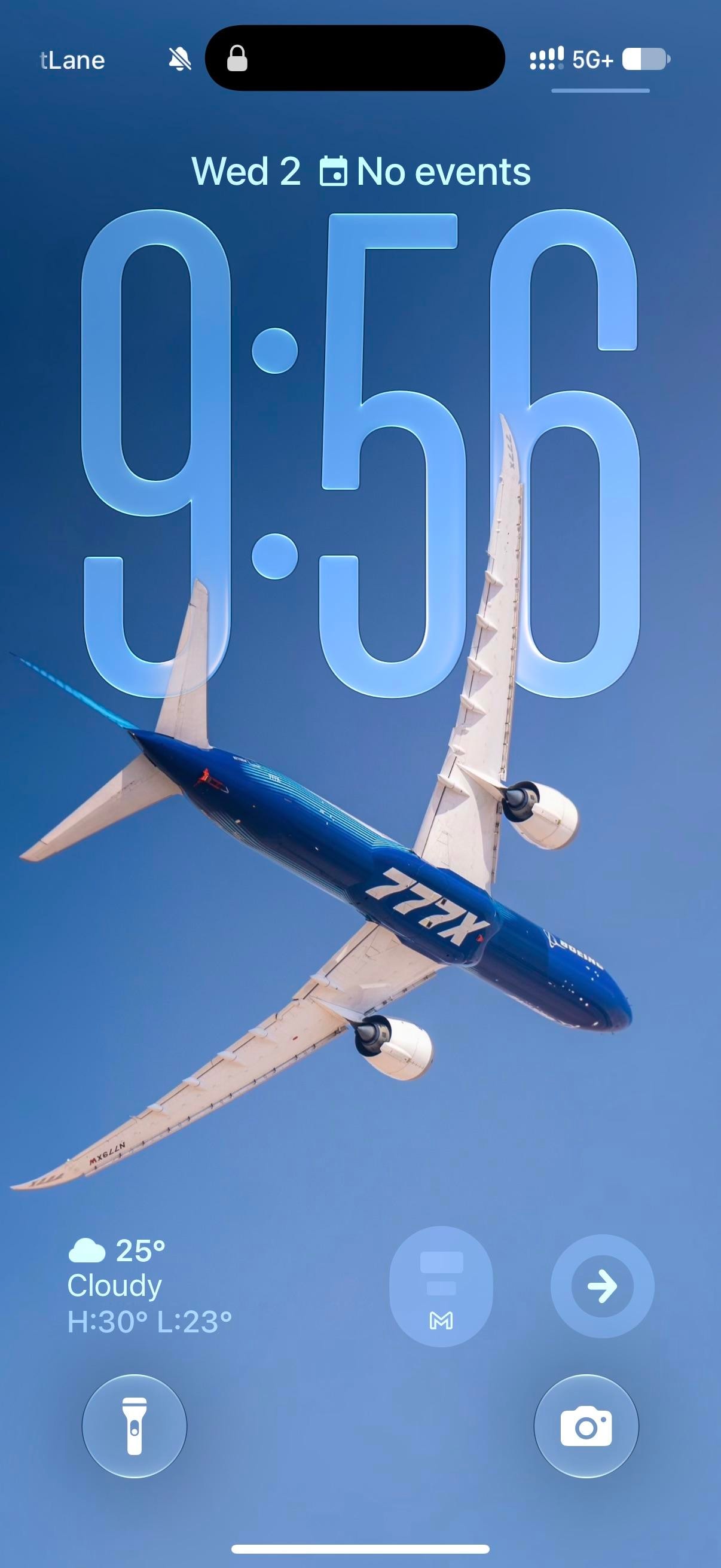
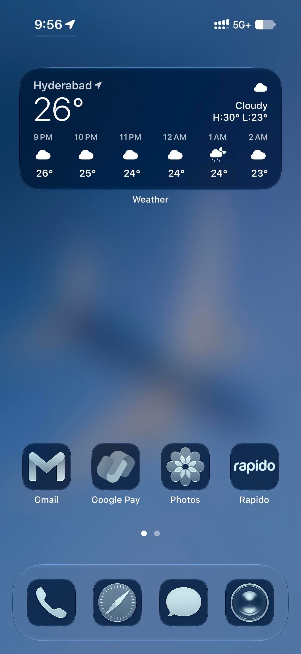
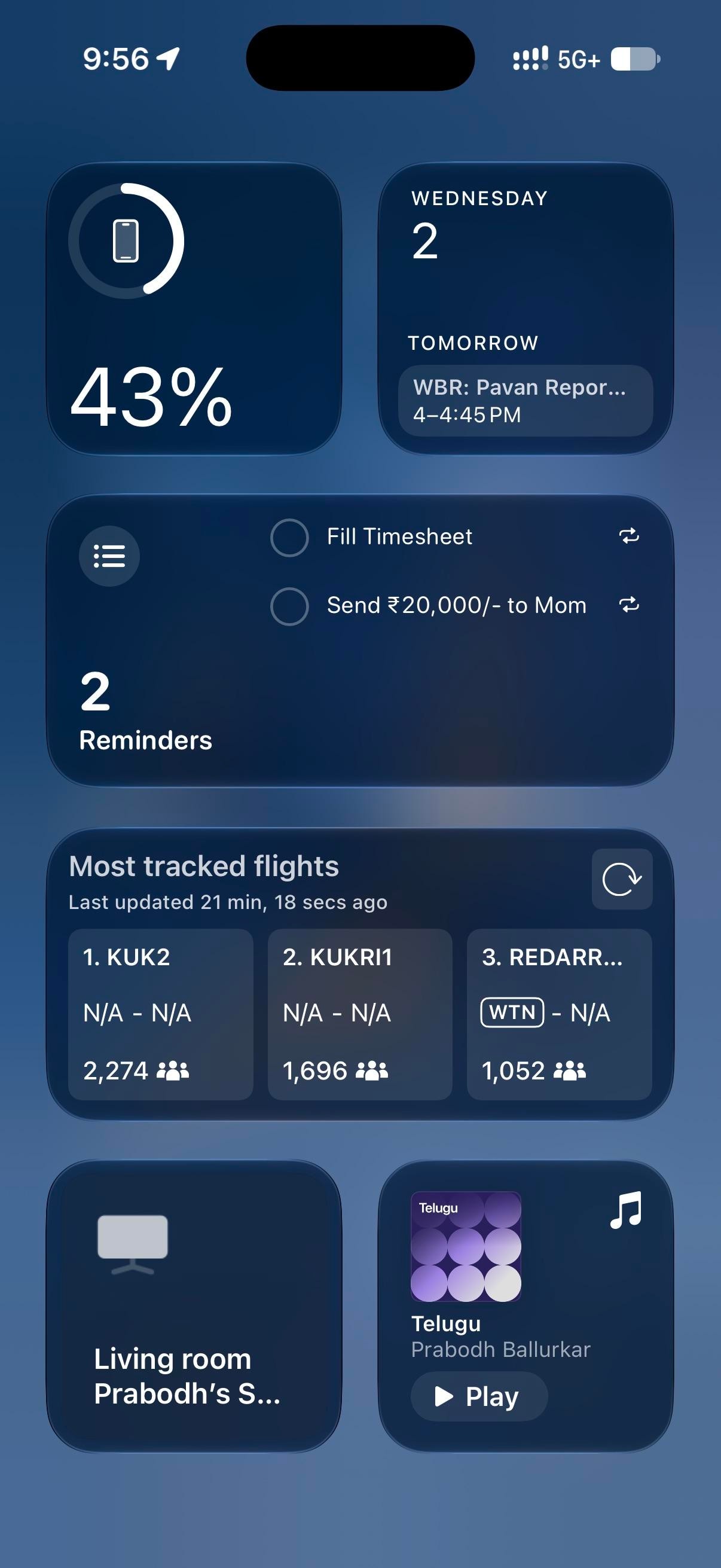
A Boeing 777X banks across a clear sky in the blue-and-white house livery. The clock sits behind it at the stretched size iOS 26 allows, glassy enough that the wing cuts in front of the last two digits. Everything after stays blue. The Home Screen blurs the plane into a gradient, and every icon takes the dark navy tint, Flightradar24 included, for a plane-spotting iPhoner running the whole phone in one hue.
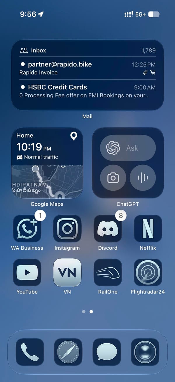
Page one holds a medium Weather widget and one row of four apps pushed down to the dock, leaving the blurred wing across the middle. Page two is denser: a medium Mail widget, small Google Maps and ChatGPT widgets, then eight apps in two rows. Today View, left of page one, is all widgets, led by Flightradar24's most-tracked-flights board over a Reminders list and a battery ring. The Lock Screen keeps its own widgets at the bottom edge, iOS 26 style: a weather readout and two round buttons, a Gmail M and a right-pointing arrow.
On this screen
Flightradar24, the theme's second half, on page two and in Today View
Google Maps, a small widget with the drive-home estimate
ChatGPT, a small widget with Ask, camera, and voice
RailOne and Rapido, trains and bike taxis, beside Google Pay on page one
WhatsApp Business, Instagram, Discord, Netflix, YouTube, and VN on page two
The dock is stock, tinted with the rest: Phone, Safari, Messages, Camera.
Page one is the part to copy, with its four apps parked on the bottom row under a widget you read rather than tap. The tint itself is one switch in the Home Screen's Customize sheet, and to my eye it's a rare tinted setup where third-party icons hold up as well as Apple's.
A plane-spotter's all-blue setup under a Boeing 777X
iOS 26's stretched glass clock sits behind a banking 777X, and every icon below takes the same navy tint, with a widget-only Today View doing the reading.
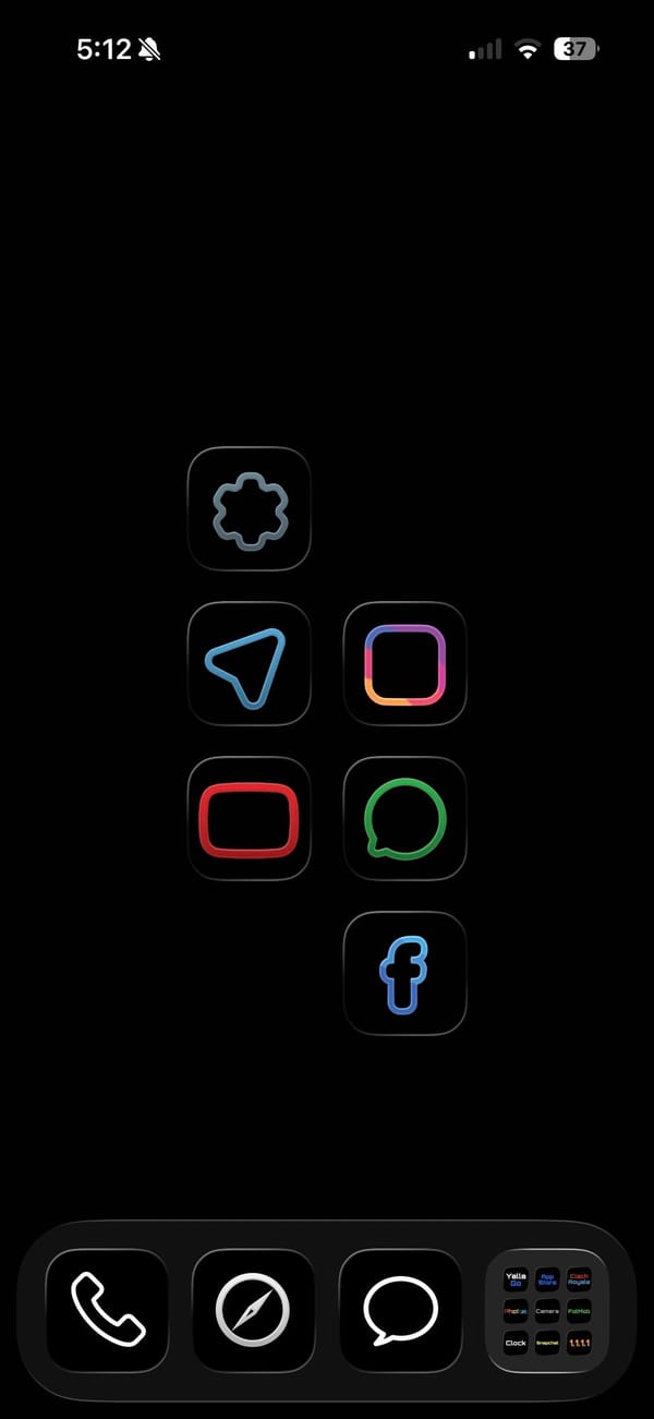
A dark theme usually still shows off its icons. This one hides them. It's a pure-black home screen for a minimalist iPhoner, a few thin neon outlines floating in the OLED with nothing else competing for attention.
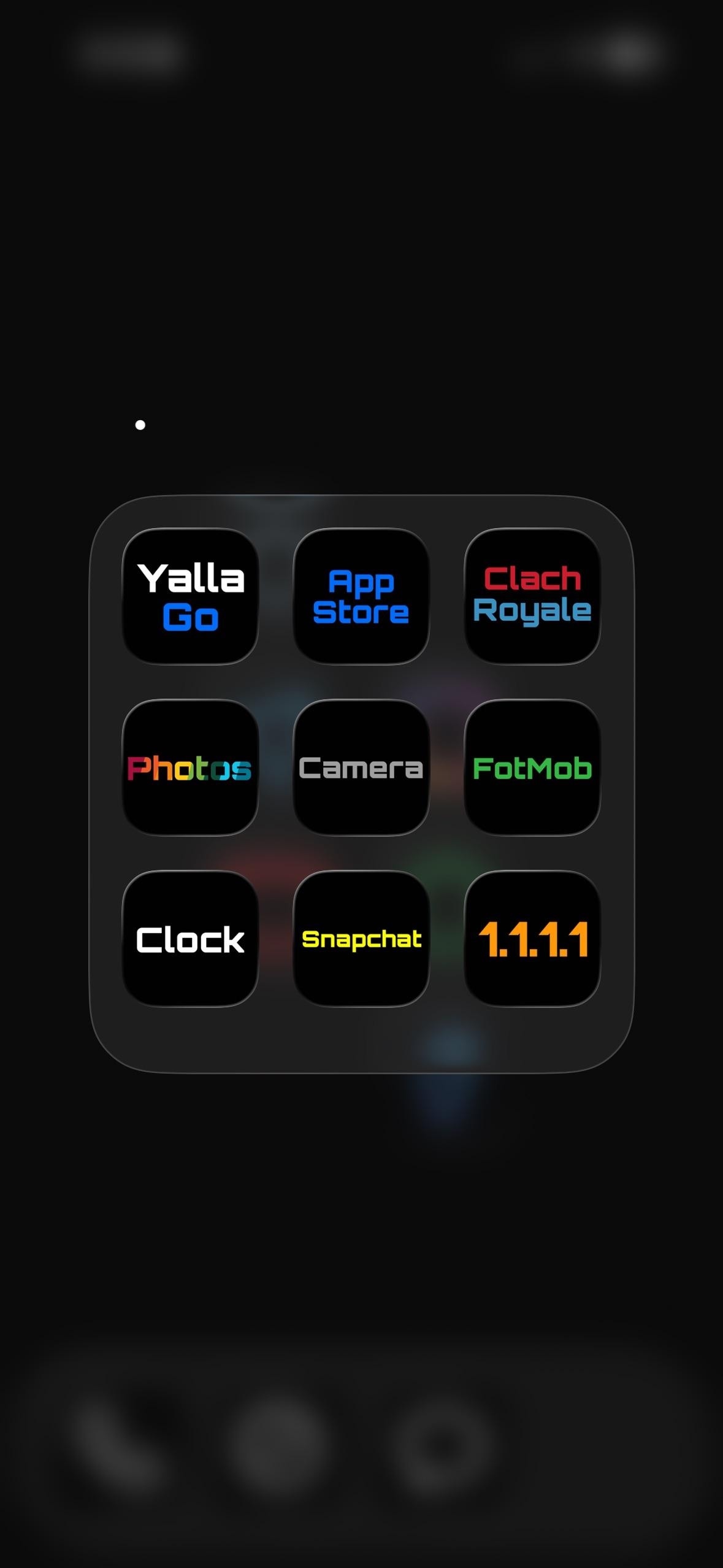
The wallpaper is just black, so on an OLED panel the empty space reads as switched-off screen. Six apps sit on the main page as colored line art: a blue paper plane for Telegram, a pink square for Instagram, a red rounded rectangle for YouTube, a green ring for WhatsApp, a gray cog for Settings, and a blue f for Facebook. The dock folder does the rest. Open it and the icons become plain text labels, each app's name in a different neon color on a black tile.
Inside that folder the labels are the icons, each a colored word on black:
App Store and 1.1.1.1 (Cloudflare's DNS app) as the utilities
Clash Royale and FotMob for a game and match scores
Snapchat and Yalla Go for chat
Photos, Camera, and Clock as the stock trio
Anyone who finds a wall of glossy icons more stressful than useful is the audience here, and a minimalist iPhoner ends up with a screen that looks powered off until it's tapped. The pure black sips less OLED battery too. It's a home screen built to disappear, and on this phone it mostly does.
Pure-black setup with neon and word icons
A minimalist iPhoner runs a pure-black home screen where the dock folder turns every app into its name, set in a different neon color per tile.
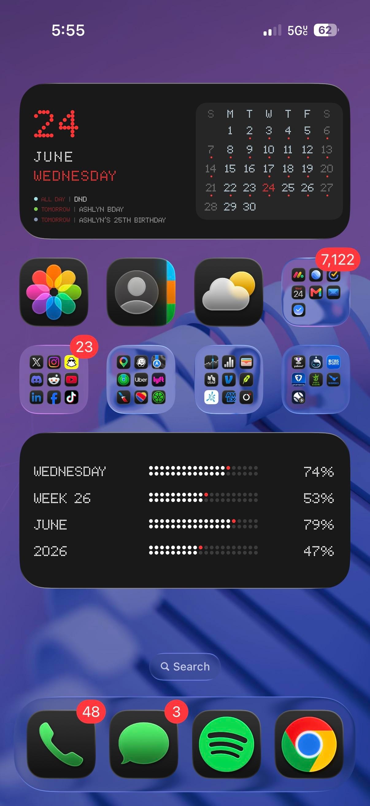
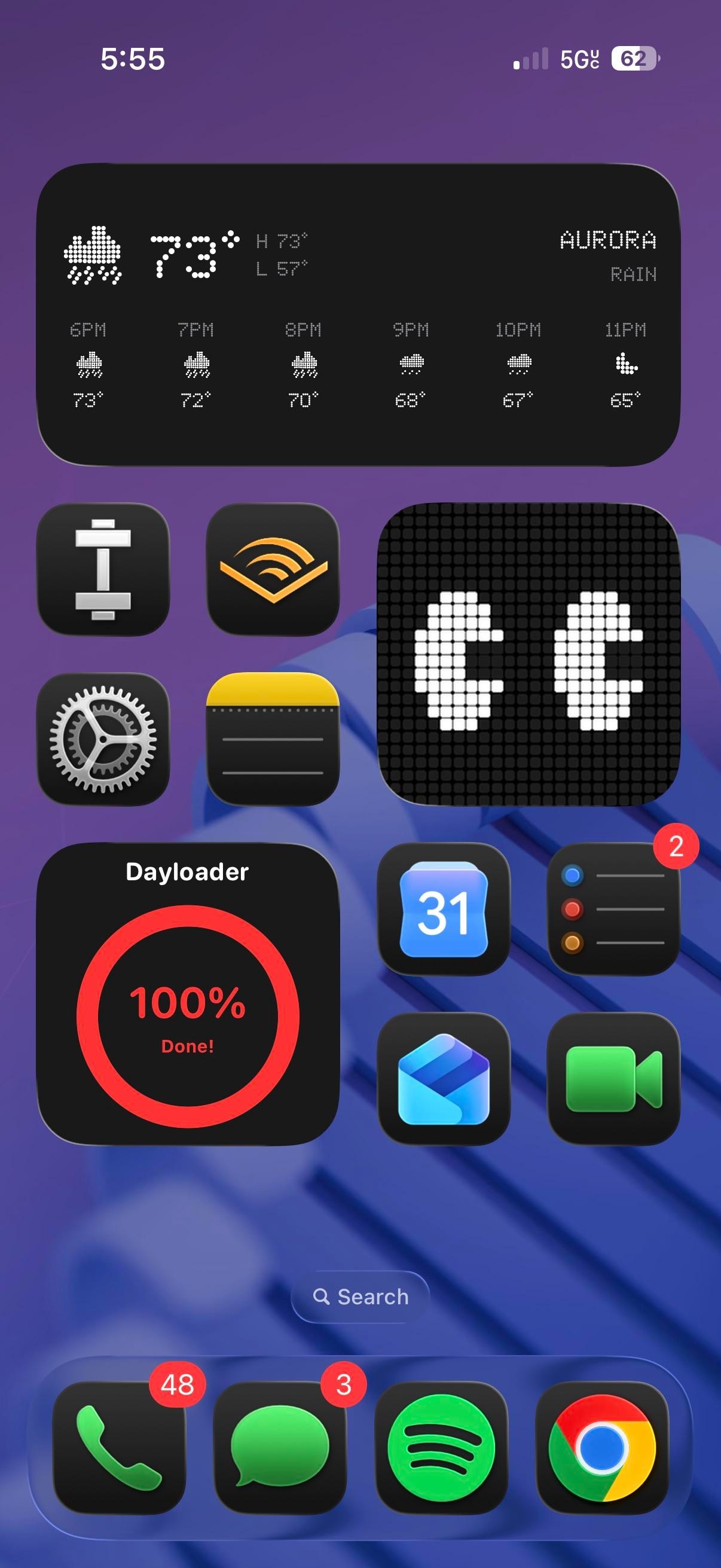
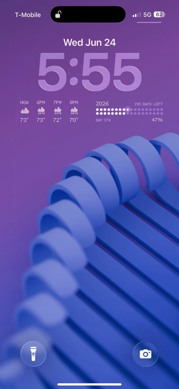
This is a power-user iPhoner who treats the whole phone like a control panel, with dot-matrix and LED-style widgets carrying the mood on every screen. Two dense home pages sit over the same purple wallpaper, a blue 3D coil twisting through it, and the lock screen picks up right where they leave off.
Everything here leans on old display hardware. A big date block spells the date out in red LED dots beside a pixel month grid, and an extra-large tracker below it fills bars for the day, week, month, and year like a scoreboard. Page two swaps in a dot-matrix weather panel and a red Dayloader ring for how much of the day is gone. The stock icons wear a dark glass treatment, glossy black tiles set against the bright wallpaper, while the social and finance folders keep their full-color app icons. None of it is subtle, and that reads as deliberate.
The app list runs heavy on inputs and errands. Photos, Contacts, and Weather sit up top next to a productivity folder with Gmail, Mail, and a stack of calendar and task apps, and the folders below sort maps and rides (Google Maps, Waze, Uber, Lyft), money (Venmo, USAA, American Express), social (X, Instagram, Reddit, TikTok), and a sports-betting group into tidy squares. Page two is the calmer one, with Audible, Notes, Settings, Reminders, Shortcuts, and a workout app around a large pixel monogram widget I can't place. The dock stops at four, Phone, Messages, Spotify, and Chrome, which pushes Google's browser and Spotify ahead of Safari and Apple Music.
What you get is a phone that quantifies the day. It's a personal readout you check like a dashboard, not a screen built to disappear. Anyone who likes dot-matrix numbers over a plain weather widget would copy this, and the power-user iPhoner who built it clearly keeps a few widget apps on hand to do it.
Dot-matrix widgets over a purple coil wallpaper
A power-user iPhoner covers two pages in dot-matrix and pixel widgets, from a red LED date block to progress bars that quietly count down the year.
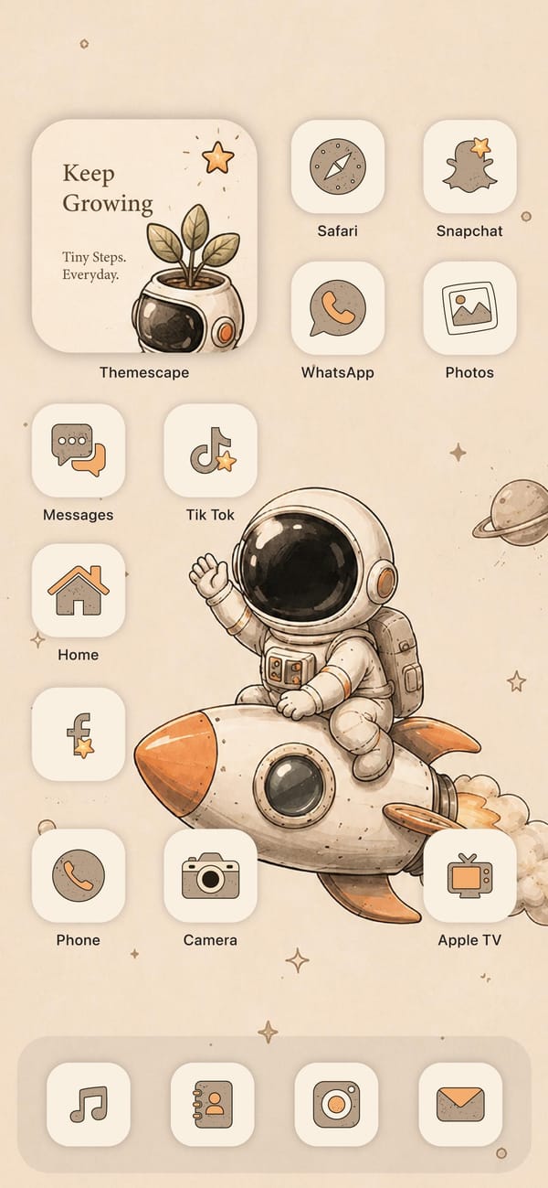
Every app on this screen has been redrawn by hand. It's the cozy end of iPhone theming, a warm beige setup for an aesthetic-first iPhoner, led by a cartoon astronaut waving from the back of a rocket.
The whole look comes from one icon pack, Themescape, which restyles every app in the same soft cream-and-tan look with orange accents. The wallpaper is a watercolor astronaut riding a rocket, stars and a little Saturn scattered across a beige sky, and the off-white icon tiles blend right into it. A widget up top reads Keep Growing, a plant sprouting from an astronaut helmet, so even the motivational card stays on theme.
Even the utilities get the treatment. Safari's compass, the Snapchat ghost, the WhatsApp phone, TikTok's note, and a little house for Home are all drawn in the same tan line art, and the dock swaps in matching Music, Contacts, Instagram, and Mail tiles. Nothing here is stock. It's a full re-skin, the kind that takes an afternoon in a theming app and some patience with the Shortcuts redirect custom icons still need.
There's a cost to all this charm: the soft contrast and word labels make apps slower to spot, so it fits an aesthetic-first iPhoner who puts mood ahead of quick access. What you get back is a phone that feels calm and handmade, a storybook you happen to text from.
A beige astronaut theme drawn entirely by hand
The Themescape icon pack restyles every app in soft cream and tan, wrapped around a watercolor astronaut wallpaper for an aesthetic-first iPhoner.
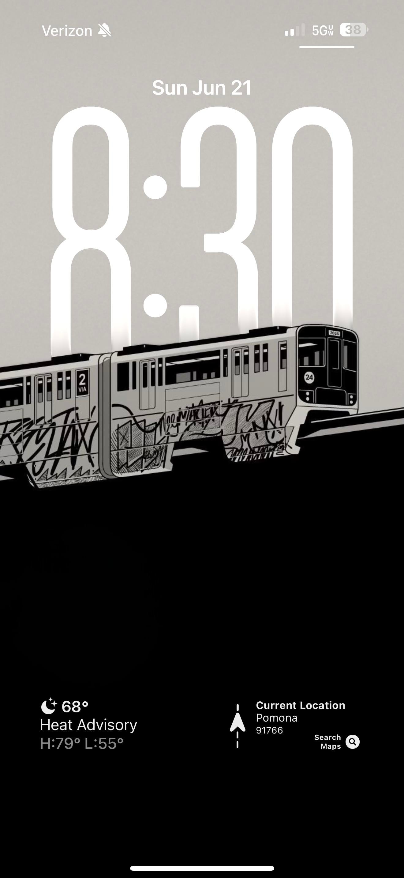
A graffiti-tagged subway car drawn in black and white, stretched across both the lock screen and the home screen. Everything else on this monochrome iPhoner's phone stays in grayscale to match it.
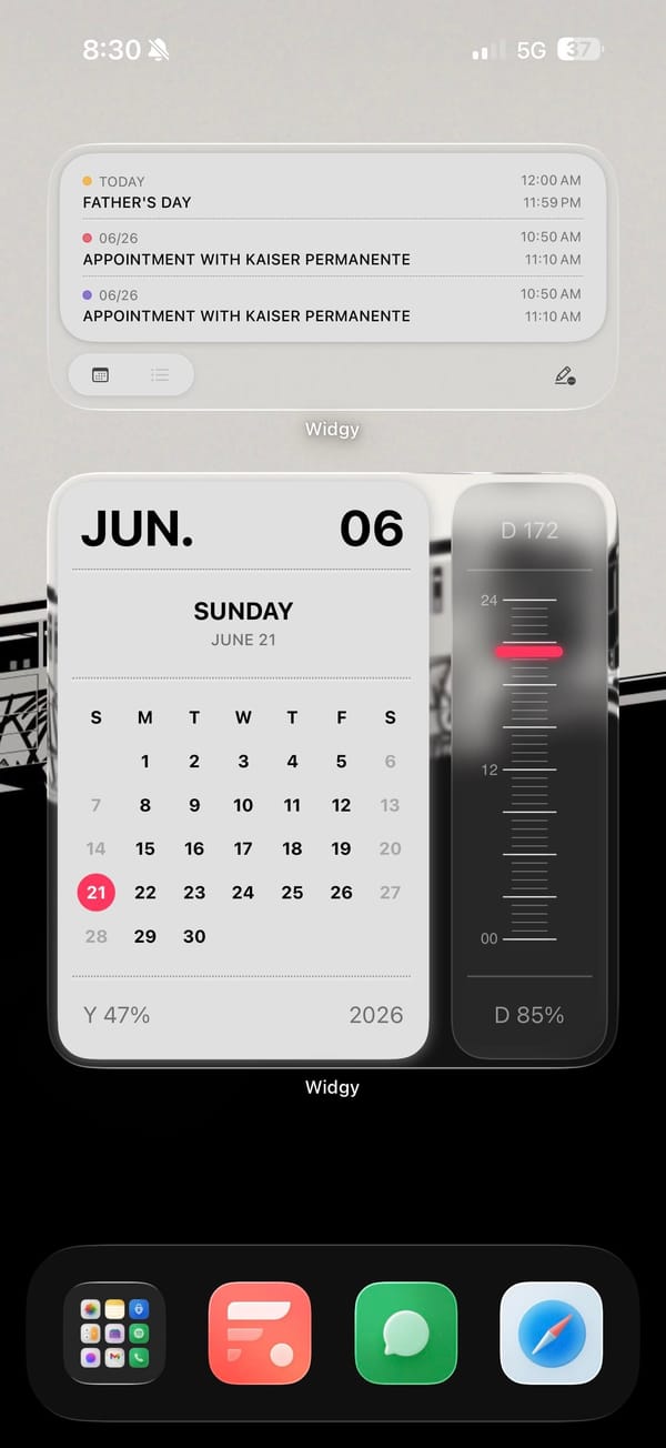
The wallpaper does the heavy lifting, a hand-drawn subway car covered in marker-style graffiti tags. Over it sit three Widgy widgets in the same palette. A month calendar block and an agenda list handle the dates and appointments, while a tall vertical gauge tracks how far through the day you are. That gauge carries one red line, the only color anywhere on the screen.
The dock keeps a little of the color the rest gave up. Fantastical's red tile, the green Messages bubble, and blue Safari sit beside a folder of stock apps like Photos, Notes, and Spotify, so the grayscale is a wallpaper-and-widgets choice, not a full icon-pack overhaul. That makes it a lighter lift than it looks.
Copy it if you like a gritty, monochrome look but don't want to re-skin fifty apps. The wallpaper and two Widgy widgets carry the whole aesthetic, and the stock dock underneath means nothing breaks when an app changes its icon. The vertical day-gauge is the piece worth stealing on its own, a progress bar you actually glance at.
A black-and-white graffiti train runs the look
One hand-drawn subway car in grayscale anchors a monochrome iPhoner setup, where three Widgy widgets add just a single red line of color.
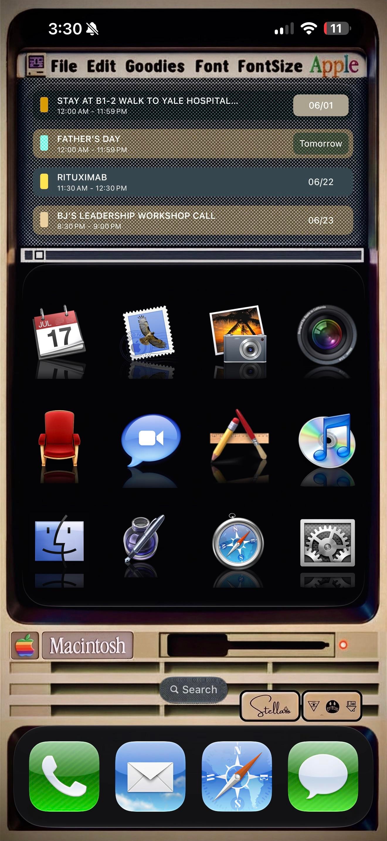
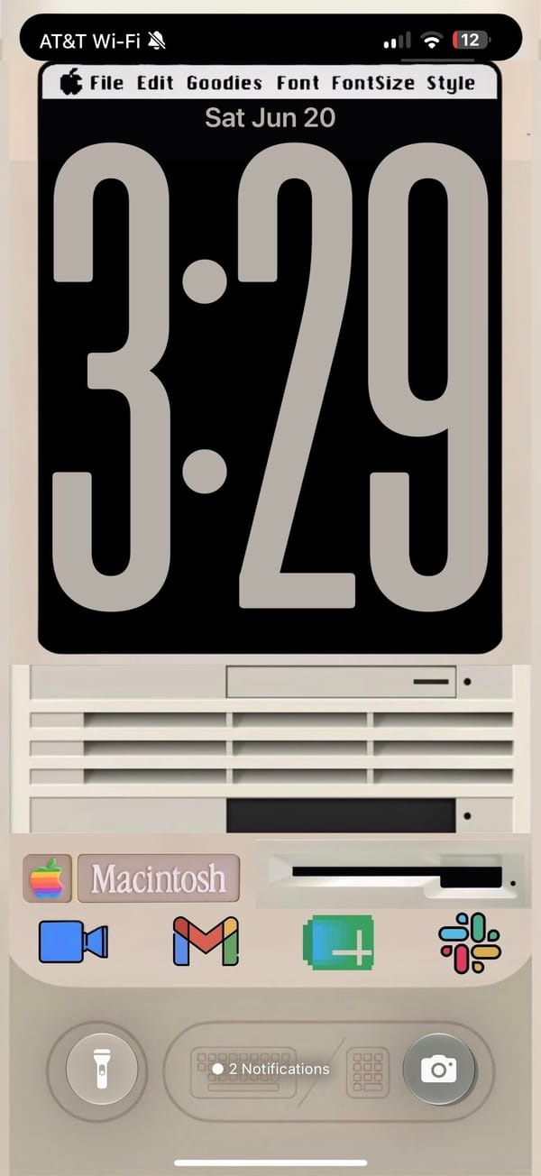
A rainbow Apple logo up top, a menu bar reading File, Edit, Goodies, Font, and a beige Macintosh parked where the wallpaper usually goes. This is a retro iPhoner rebuilding the classic Mac desktop on an iPhone, menu bar and all.
The theme, credited to a Stellario signature by the search bar, leans hard on skeuomorphism. The top of the home screen is a Widgy widget dressed as an old SimpleText window, complete with a title bar, a scroll track, and a working agenda list inside. Below it, twelve app icons sit on a glossy black shelf with mirror reflections, the exact look of early Mac OS X. The lock screen keeps the bit going, a chunky retro clock on a black monitor, then the cream Macintosh case underneath with its floppy slot, vents, and a Macintosh nameplate.
The icons are the love letter. Calendar is the tear-off July block, Mail is the old postage-stamp bird, Photos is the palm-tree iPhoto shot, and the Finder smiley, the silver Safari compass, and the geared System Preferences all come straight from an old Mac OS X dock. iTunes even shows up as a CD with the rainbow note, an app Apple retired years ago. The dock swaps in matching skeuomorphic Phone, Mail, Safari, and Messages, so nothing gives away that this is a modern iPhone until you read the status bar.
Copying this is a real commitment, since every icon is a custom Shortcut and the menu bar is just a widget faking it. But for a retro iPhoner who grew up on the beige Macs, or just misses when software had texture, it turns the phone into a tiny museum piece you actually carry.
A classic Macintosh theme down to the menu bar
A retro iPhoner rebuilds the classic Mac look, from the rainbow Apple logo to skeuomorphic Finder and iTunes icons over a beige Macintosh.
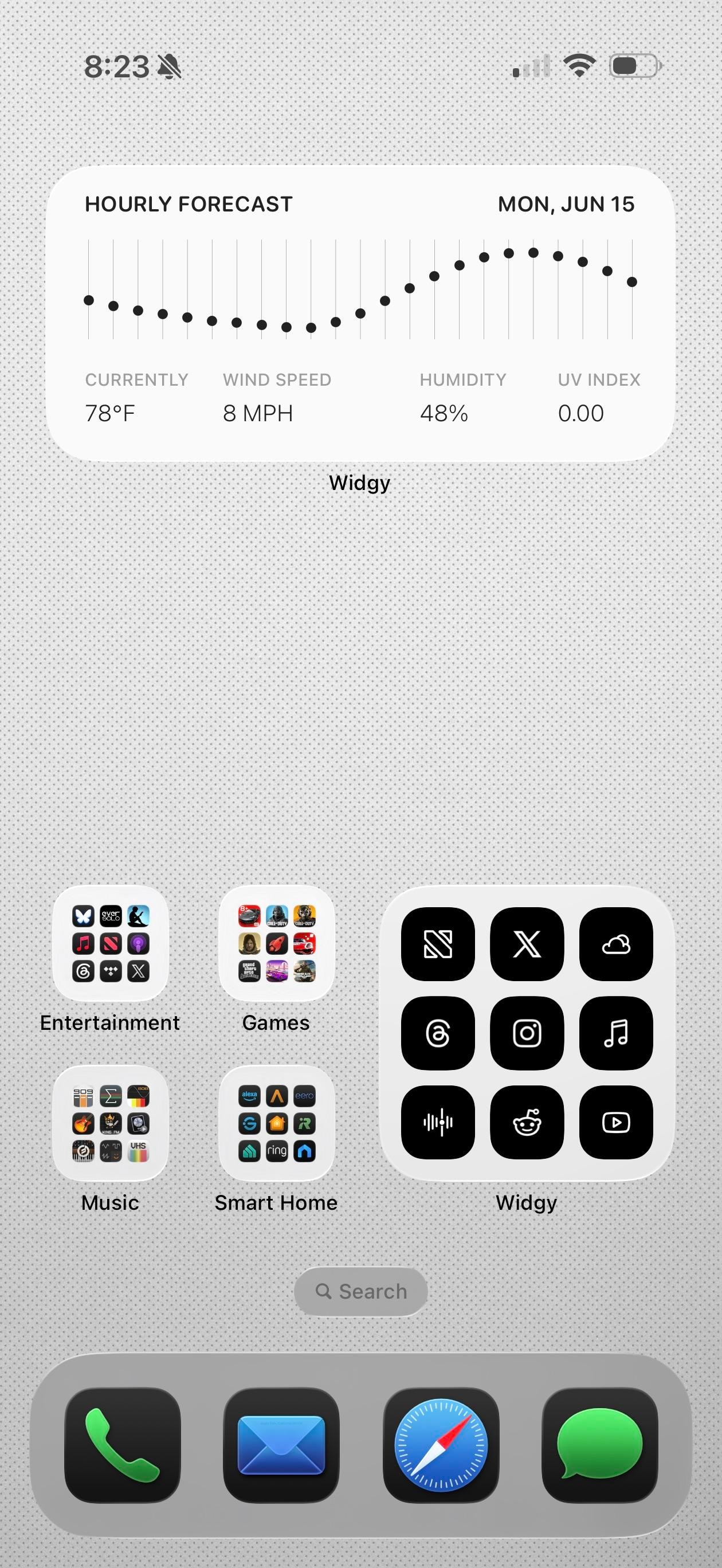
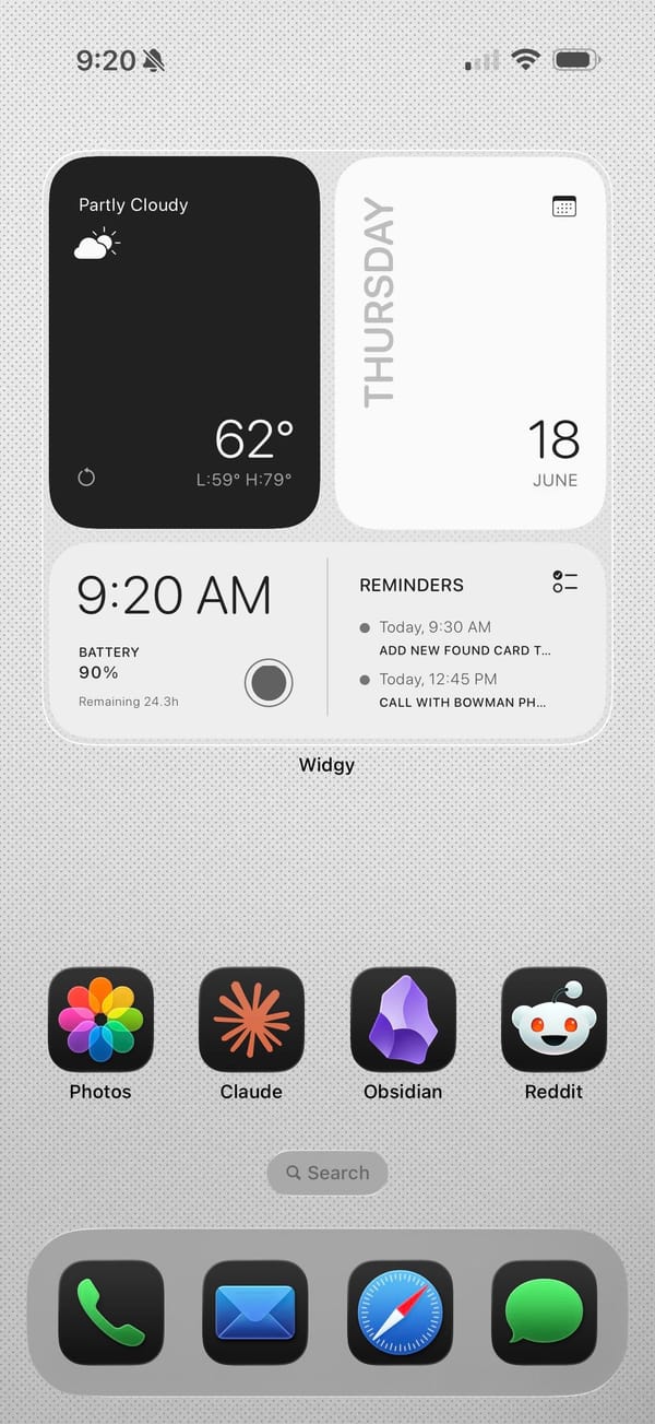
Claude, Obsidian, and Reddit in the app row tell you the story. This is a productivity iPhoner's setup, a clean light-gray canvas built on Widgy widgets and a notes-first workflow.
The background is a pale dotted grid, almost graph paper, which keeps the whole thing feeling like a workspace. Widgy runs the top of both pages: an hourly forecast graph on one, and a weather block, a big Thursday calendar, and a time-and-battery panel with the next reminders on the other. The widgets are black on white and information-first, no decoration, so the data is the design.
The apps split between color and grayscale. Folders for Games, Music, Entertainment, and Smart Home keep their real icons in full grids, while a separate Widgy folder holds black glyph versions of X, Threads, Instagram, and NetNewsWire for the apps checked most. Down in the row, Photos, Claude, Obsidian, and Reddit stay in full color, and the dock stays stock with Phone, Mail, Safari, and Messages. It's a power user's compromise, pretty widgets up top and fast icons where speed matters.
Worth copying if you live in a notes app and want the home screen to read like a control panel, not a photo gallery. The Widgy widgets don't build themselves, but once they're set they show the whole day at a glance.
A light Widgy dashboard for Obsidian and Claude
A productivity iPhoner keeps Obsidian, Claude, and Reddit one tap away, under Widgy widgets that turn a plain gray grid into a control panel.
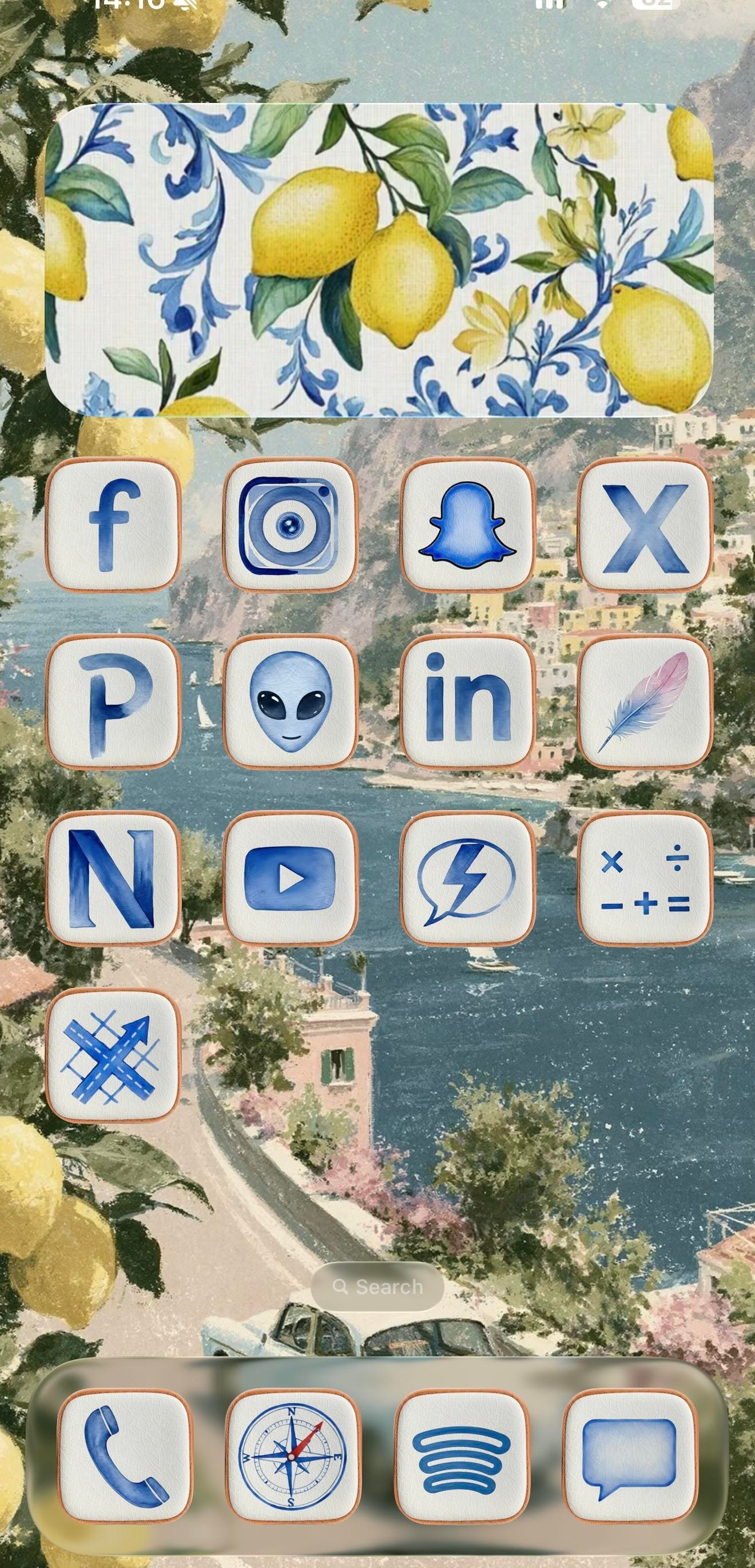
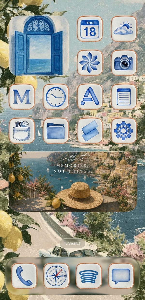
This is a setup for the iPhoner who'd rather be on the Amalfi Coast. Every surface leans into one watercolor Italian summer, from a painted Positano coastline to the lemons spilling in at the edges and the blue-and-white Sicilian tilework on the widgets.
The wallpaper is the anchor, a soft coastal painting of cliffside town, blue water, and a winding road that carries unbroken across both home pages. On top of it sit cream icon tiles with thin terracotta borders, each holding a blue watercolor glyph in place of the stock art. Decorative widgets do the rest of the mood work: a lemon-and-tile panel on page one, an open blue shutter window on page two, and a wide 'collect memories, not things' travel card over a straw-hat-and-lemon scene. It reads as a cohesive theme rather than a wallpaper with icons dropped on top.
Under the theme, the app lineup tells a more online story than the aesthetic lets on. Page one is almost entirely social: Facebook, Instagram, Snapchat, X, LinkedIn, YouTube, and a Pinterest P, alongside a few I can't name with confidence, a grey alien face, a lone feather, an N-monogram tile. Page two turns practical, with Calendar, Weather, Clock, Notes, Wallet, Files, and Settings under the same watercolor treatment. The dock holds four anchors across both pages: Phone, the stock Compass, Spotify's curves, and Messages.
Worth copying if you're an aesthetic-first iPhoner who wants a vacation on the Lock Screen without installing a single new app. The trick is consistency, one painted scene and one custom icon set repeated until the phone reads like a postcard. Pick the theme before the apps, and the rest falls in line.
An Amalfi Coast theme in watercolor blue
A traveler-at-heart iPhoner wraps a social-forward grid in blue watercolor icons, lemon tiles, and a painted Positano coast that runs across both pages.
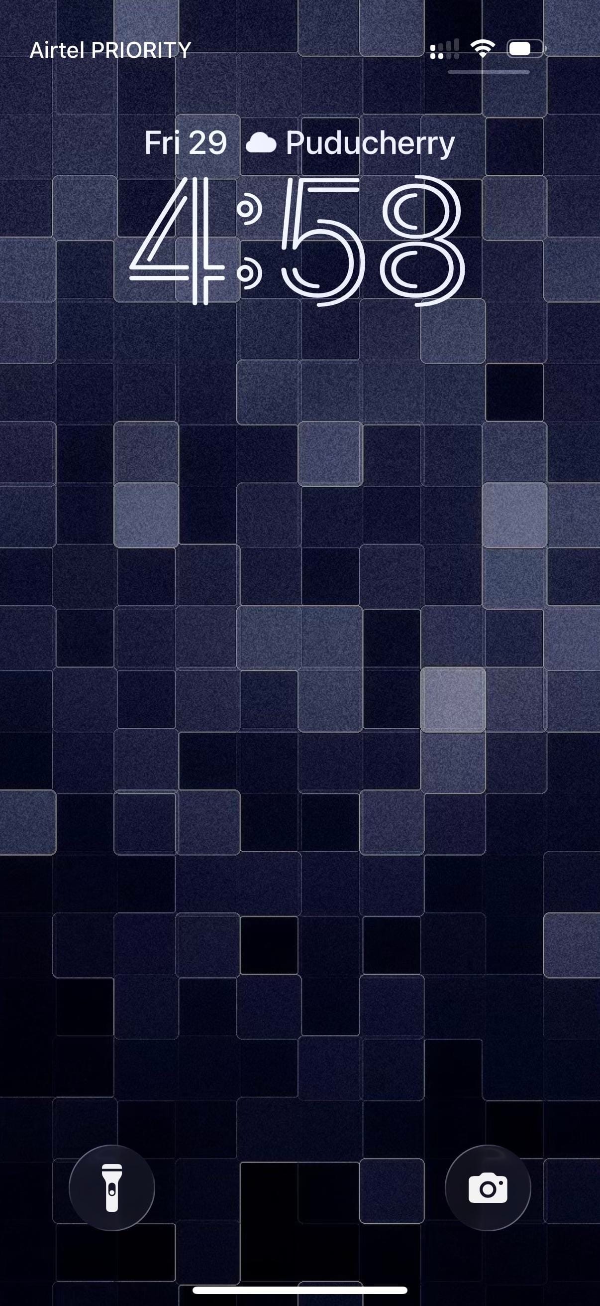
A traveler iPhoner home screen. The wallpaper is a mosaic of deep navy and indigo tiles shifting across four shades of blue-grey, landing somewhere between a pixel grid and a stone mosaic depending on how far back you hold the phone.
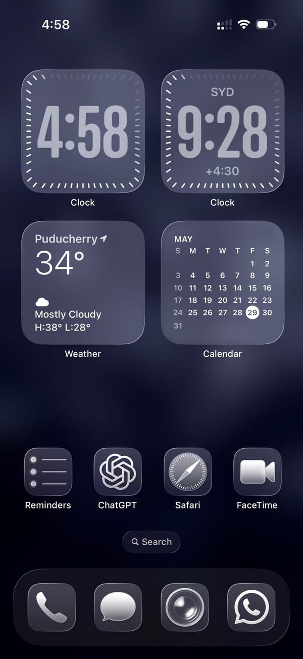
Four medium widgets fill the top two-thirds of the home screen in a 2x2 grid. Two Clock widgets sit at the top: one for local time, the other locked to Sydney, which puts the same face in two different time zones. Below them, Weather and a Calendar month-view take the remaining two slots. A single row of apps separates the widget block from an empty stretch of wallpaper before the dock.
Reminders, ChatGPT, Safari, and FaceTime make up that row. Just stock icons throughout. The dock holds Phone, Messages, what looks like Camera, and WhatsApp, four apps that cover the obvious communication bases across platforms. The whole setup runs in fours, top to bottom.
Worth copying for iPhoners who track two time zones daily and want the clocks on the home screen without building out a full widget stack.
A dual-timezone home screen and a mosaic wallpaper
A traveler iPhoner setup built on dual Clock widgets for two time zones, a deep navy mosaic lock screen, and ChatGPT in the main row.