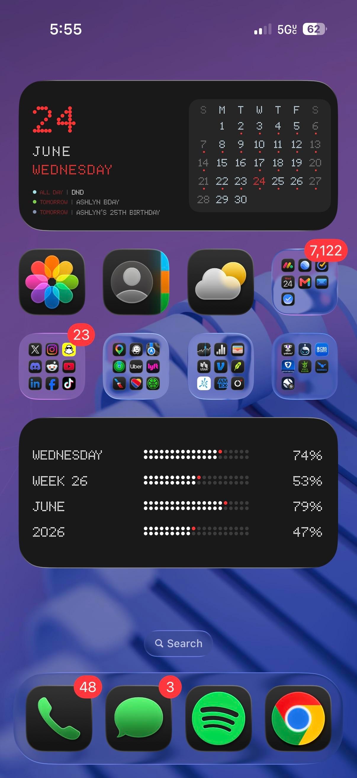
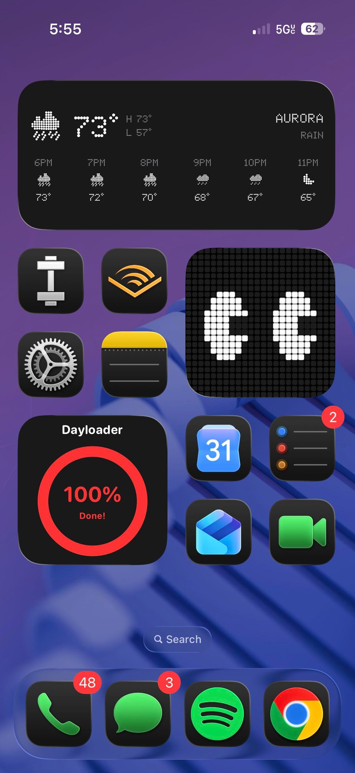
This is a power-user iPhoner who treats the whole phone like a control panel, with dot-matrix and LED-style widgets carrying the mood on every screen. Two dense home pages sit over the same purple wallpaper, a blue 3D coil twisting through it, and the lock screen picks up right where they leave off.
Everything here leans on old display hardware. A big date block spells the date out in red LED dots beside a pixel month grid, and an extra-large tracker below it fills bars for the day, week, month, and year like a scoreboard. Page two swaps in a dot-matrix weather panel and a red Dayloader ring for how much of the day is gone. The stock icons wear a dark glass treatment, glossy black tiles set against the bright wallpaper, while the social and finance folders keep their full-color app icons. None of it is subtle, and that reads as deliberate.
The app list runs heavy on inputs and errands. Photos, Contacts, and Weather sit up top next to a productivity folder with Gmail, Mail, and a stack of calendar and task apps, and the folders below sort maps and rides (Google Maps, Waze, Uber, Lyft), money (Venmo, USAA, American Express), social (X, Instagram, Reddit, TikTok), and a sports-betting group into tidy squares. Page two is the calmer one, with Audible, Notes, Settings, Reminders, Shortcuts, and a workout app around a large pixel monogram widget I can't place. The dock stops at four, Phone, Messages, Spotify, and Chrome, which pushes Google's browser and Spotify ahead of Safari and Apple Music.
What you get is a phone that quantifies the day. It's a personal readout you check like a dashboard, not a screen built to disappear. Anyone who likes dot-matrix numbers over a plain weather widget would copy this, and the power-user iPhoner who built it clearly keeps a few widget apps on hand to do it.