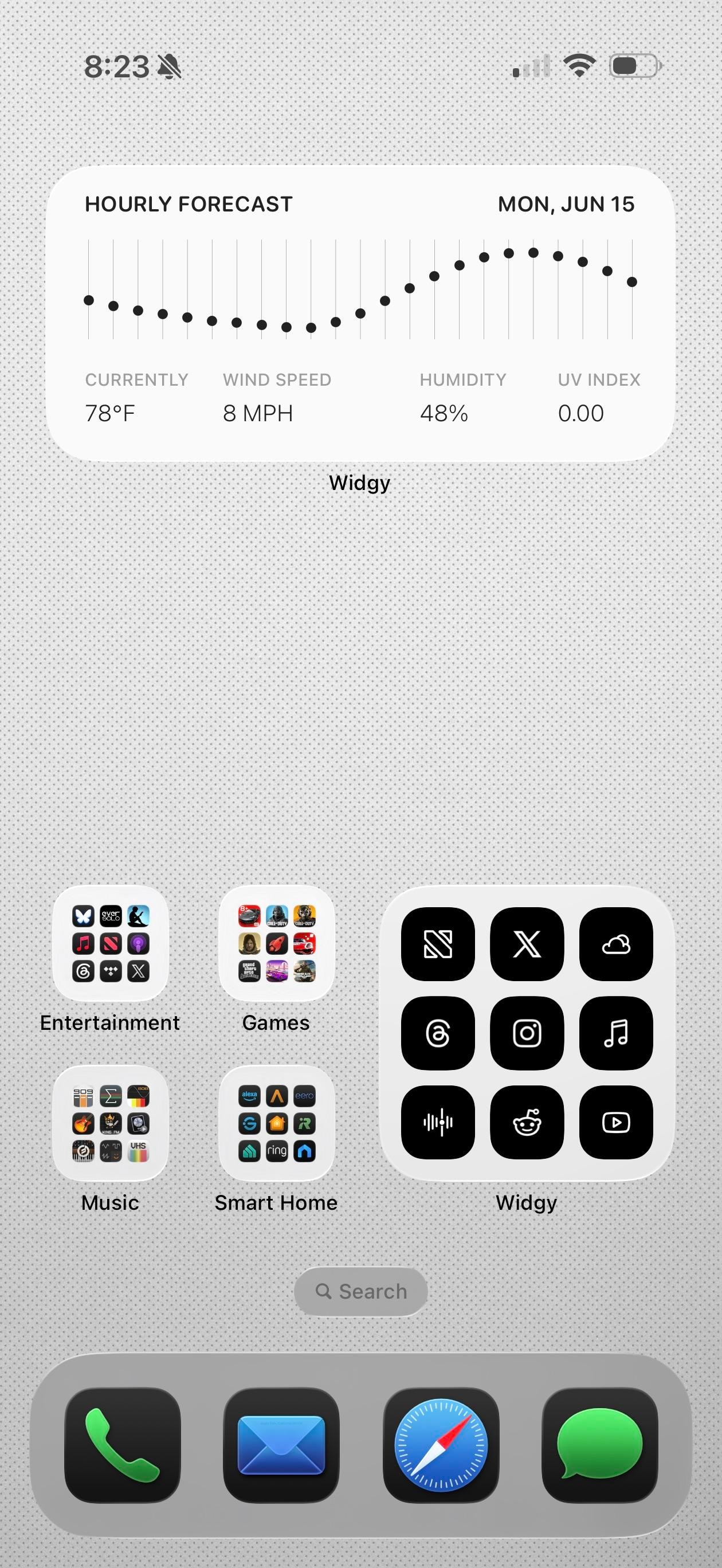
Claude, Obsidian, and Reddit in the app row tell you the story. This is a productivity iPhoner's setup, a clean light-gray canvas built on Widgy widgets and a notes-first workflow.
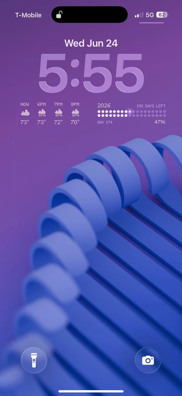
The background is a pale dotted grid, almost graph paper, which keeps the whole thing feeling like a workspace. Widgy runs the top of both pages: an hourly forecast graph on one, and a weather block, a big Thursday calendar, and a time-and-battery panel with the next reminders on the other. The widgets are black on white and information-first, no decoration, so the data is the design.
The apps split between color and grayscale. Folders for Games, Music, Entertainment, and Smart Home keep their real icons in full grids, while a separate Widgy folder holds black glyph versions of X, Threads, Instagram, and NetNewsWire for the apps checked most. Down in the row, Photos, Claude, Obsidian, and Reddit stay in full color, and the dock stays stock with Phone, Mail, Safari, and Messages. It's a power user's compromise, pretty widgets up top and fast icons where speed matters.
Worth copying if you live in a notes app and want the home screen to read like a control panel, not a photo gallery. The Widgy widgets don't build themselves, but once they're set they show the whole day at a glance.