This is a setup for the iPhoner who'd rather be on the Amalfi Coast. Every surface leans into one watercolor Italian summer, from a painted Positano coastline to the lemons spilling in at the edges and the blue-and-white Sicilian tilework on the widgets.
The wallpaper is the anchor, a soft coastal painting of cliffside town, blue water, and a winding road that carries unbroken across both home pages. On top of it sit cream icon tiles with thin terracotta borders, each holding a blue watercolor glyph in place of the stock art. Decorative widgets do the rest of the mood work: a lemon-and-tile panel on page one, an open blue shutter window on page two, and a wide 'collect memories, not things' travel card over a straw-hat-and-lemon scene. It reads as a cohesive theme rather than a wallpaper with icons dropped on top.
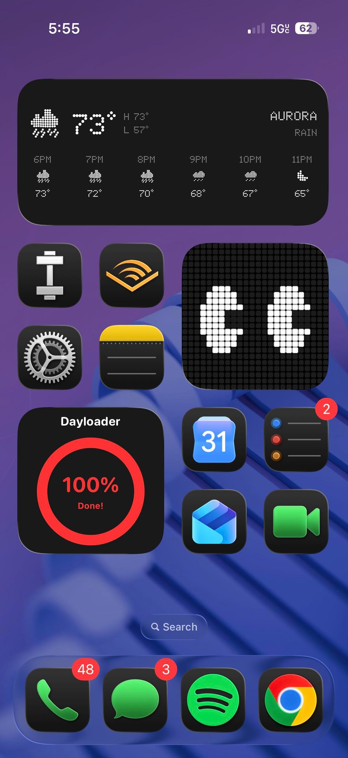
Under the theme, the app lineup tells a more online story than the aesthetic lets on. Page one is almost entirely social: Facebook, Instagram, Snapchat, X, LinkedIn, YouTube, and a Pinterest P, alongside a few I can't name with confidence, a grey alien face, a lone feather, an N-monogram tile. Page two turns practical, with Calendar, Weather, Clock, Notes, Wallet, Files, and Settings under the same watercolor treatment. The dock holds four anchors across both pages: Phone, the stock Compass, Spotify's curves, and Messages.
Worth copying if you're an aesthetic-first iPhoner who wants a vacation on the Lock Screen without installing a single new app. The trick is consistency, one painted scene and one custom icon set repeated until the phone reads like a postcard. Pick the theme before the apps, and the rest falls in line.