
Apple Watch redesign may break band compatibility
A Weibo leaker says the Series 13 redesign swaps the band connector for a thinner case and bigger battery, so hold off buying spare straps.
A Weibo leaker says the Series 13 redesign swaps the band connector for a thinner case and bigger battery, so hold off buying spare straps.
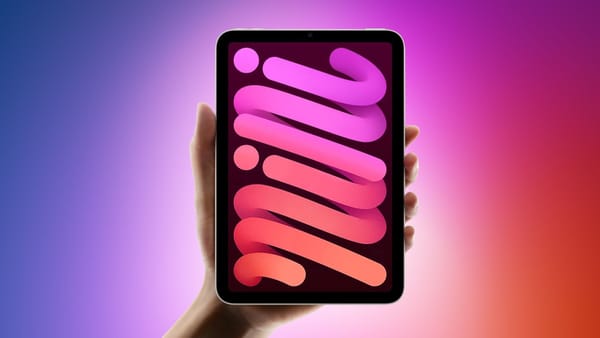
Even with the launch window still unsettled, the next iPad mini's real story is the jump from a 60Hz LCD to a 120Hz OLED panel, plus an A19 Pro chip.
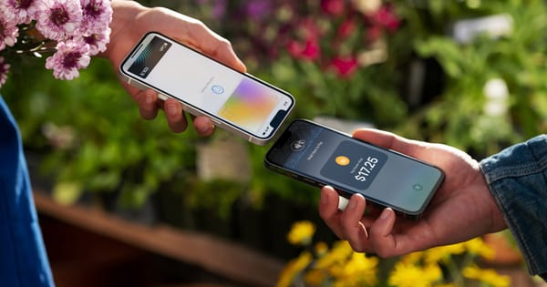
A merchant's iPhone can pull contacts, receipts, and Wallet passes from a customer mid-payment, but Apple is keeping the feature out of the EU.
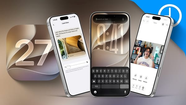
Apple's WWDC keynote slide counted 250-plus changes across iOS 27, iPadOS 27, and macOS Golden Gate, where the under-the-hood fixes carry the upgrade.
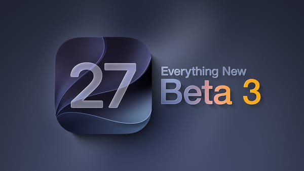
Apple's iOS 27 beta 3 is a light release, and MacRumors host Dan Barbera spends most of his rundown

Apple has a new ad out for the AirPods Pro 3, and it leans on a famous face. Vini Jr.
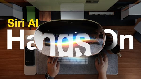
Apple spent WWDC 2026 reintroducing Siri, and MacRumors' Dan Barbera ran the iOS 27 developer beta to see how much
9to5Mac's Fernando Silva installed iOS 27 developer beta 1 on his main iPhone 17 Pro, and the headline of
A dark theme usually still shows off its icons. This one hides them. It's a pure-black home screen for a minimalist iPhoner, a few thin neon outlines floating in the OLED with nothing else competing for attention.
The wallpaper is just black, so on an OLED panel the empty space reads as switched-off screen. Six apps sit on the main page as colored line art: a blue paper plane for Telegram, a pink square for Instagram, a red rounded rectangle for YouTube, a green ring for WhatsApp, a gray cog for Settings, and a blue f for Facebook. The dock folder does the rest. Open it and the icons become plain text labels, each app's name in a different neon color on a black tile.
Inside that folder the labels are the icons, each a colored word on black:
Anyone who finds a wall of glossy icons more stressful than useful is the audience here, and a minimalist iPhoner ends up with a screen that looks powered off until it's tapped. The pure black sips less OLED battery too. It's a home screen built to disappear, and on this phone it mostly does.
A minimalist iPhoner runs a pure-black home screen where the dock folder turns every app into its name, set in a different neon color per tile.
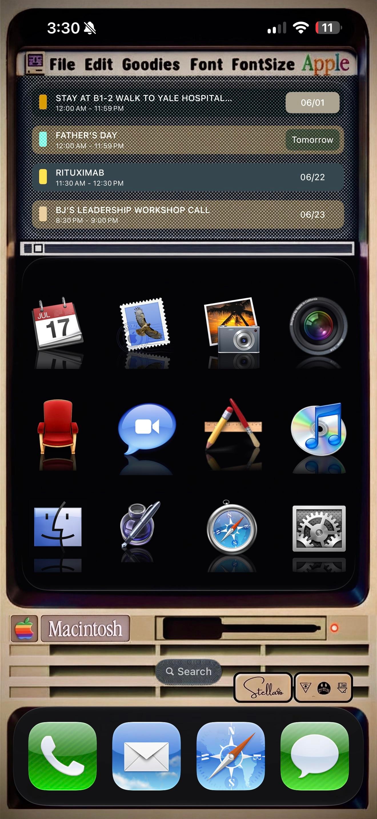
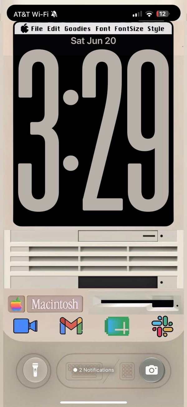
A rainbow Apple logo up top, a menu bar reading File, Edit, Goodies, Font, and a beige Macintosh parked where the wallpaper usually goes. This is a retro iPhoner rebuilding the classic Mac desktop on an iPhone, menu bar and all.
The theme, credited to a Stellario signature by the search bar, leans hard on skeuomorphism. The top of the home screen is a Widgy widget dressed as an old SimpleText window, complete with a title bar, a scroll track, and a working agenda list inside. Below it, twelve app icons sit on a glossy black shelf with mirror reflections, the exact look of early Mac OS X. The lock screen keeps the bit going, a chunky retro clock on a black monitor, then the cream Macintosh case underneath with its floppy slot, vents, and a Macintosh nameplate.
The icons are the love letter. Calendar is the tear-off July block, Mail is the old postage-stamp bird, Photos is the palm-tree iPhoto shot, and the Finder smiley, the silver Safari compass, and the geared System Preferences all come straight from an old Mac OS X dock. iTunes even shows up as a CD with the rainbow note, an app Apple retired years ago. The dock swaps in matching skeuomorphic Phone, Mail, Safari, and Messages, so nothing gives away that this is a modern iPhone until you read the status bar.
Copying this is a real commitment, since every icon is a custom Shortcut and the menu bar is just a widget faking it. But for a retro iPhoner who grew up on the beige Macs, or just misses when software had texture, it turns the phone into a tiny museum piece you actually carry.
A retro iPhoner rebuilds the classic Mac look, from the rainbow Apple logo to skeuomorphic Finder and iTunes icons over a beige Macintosh.
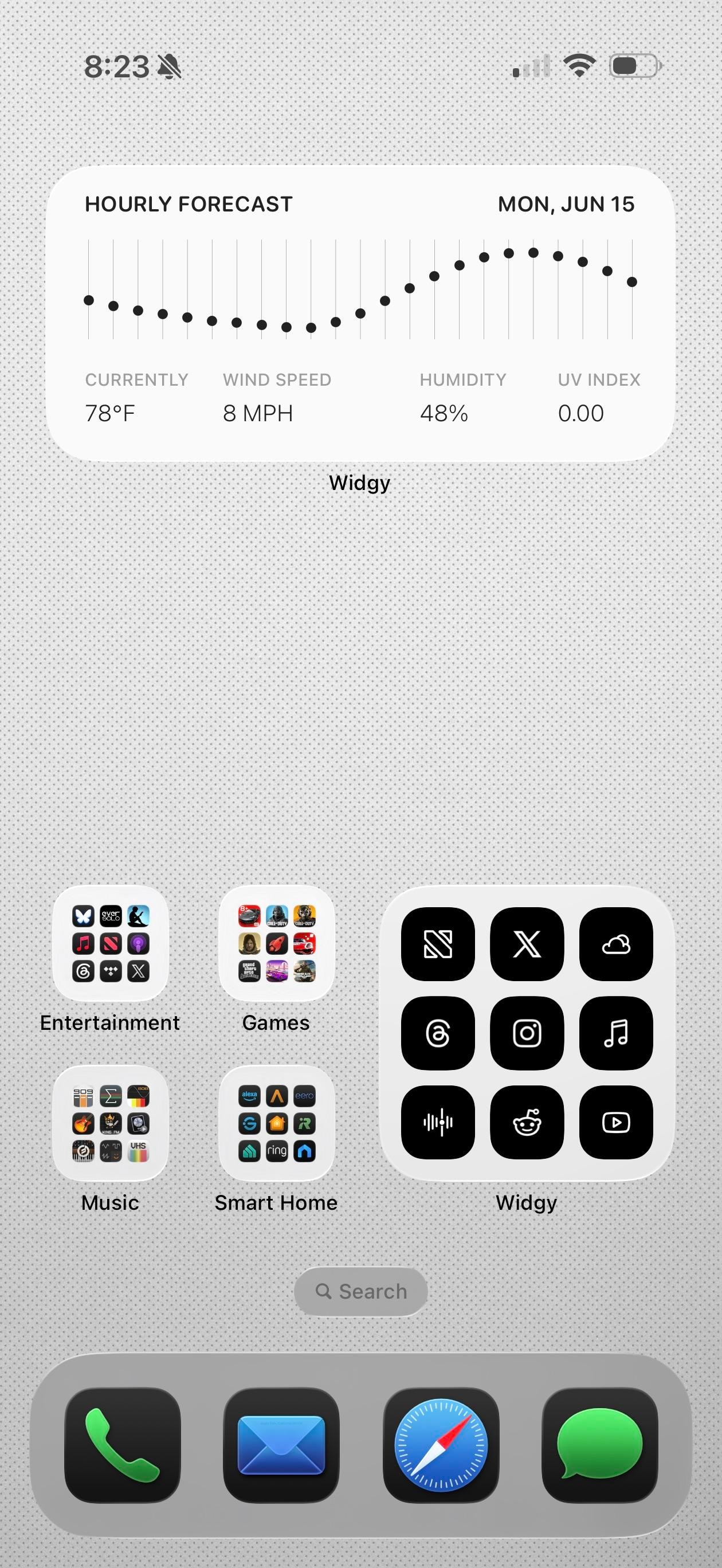
Claude, Obsidian, and Reddit in the app row tell you the story. This is a productivity iPhoner's setup, a clean light-gray canvas built on Widgy widgets and a notes-first workflow.
The background is a pale dotted grid, almost graph paper, which keeps the whole thing feeling like a workspace. Widgy runs the top of both pages: an hourly forecast graph on one, and a weather block, a big Thursday calendar, and a time-and-battery panel with the next reminders on the other. The widgets are black on white and information-first, no decoration, so the data is the design.
The apps split between color and grayscale. Folders for Games, Music, Entertainment, and Smart Home keep their real icons in full grids, while a separate Widgy folder holds black glyph versions of X, Threads, Instagram, and NetNewsWire for the apps checked most. Down in the row, Photos, Claude, Obsidian, and Reddit stay in full color, and the dock stays stock with Phone, Mail, Safari, and Messages. It's a power user's compromise, pretty widgets up top and fast icons where speed matters.
Worth copying if you live in a notes app and want the home screen to read like a control panel, not a photo gallery. The Widgy widgets don't build themselves, but once they're set they show the whole day at a glance.
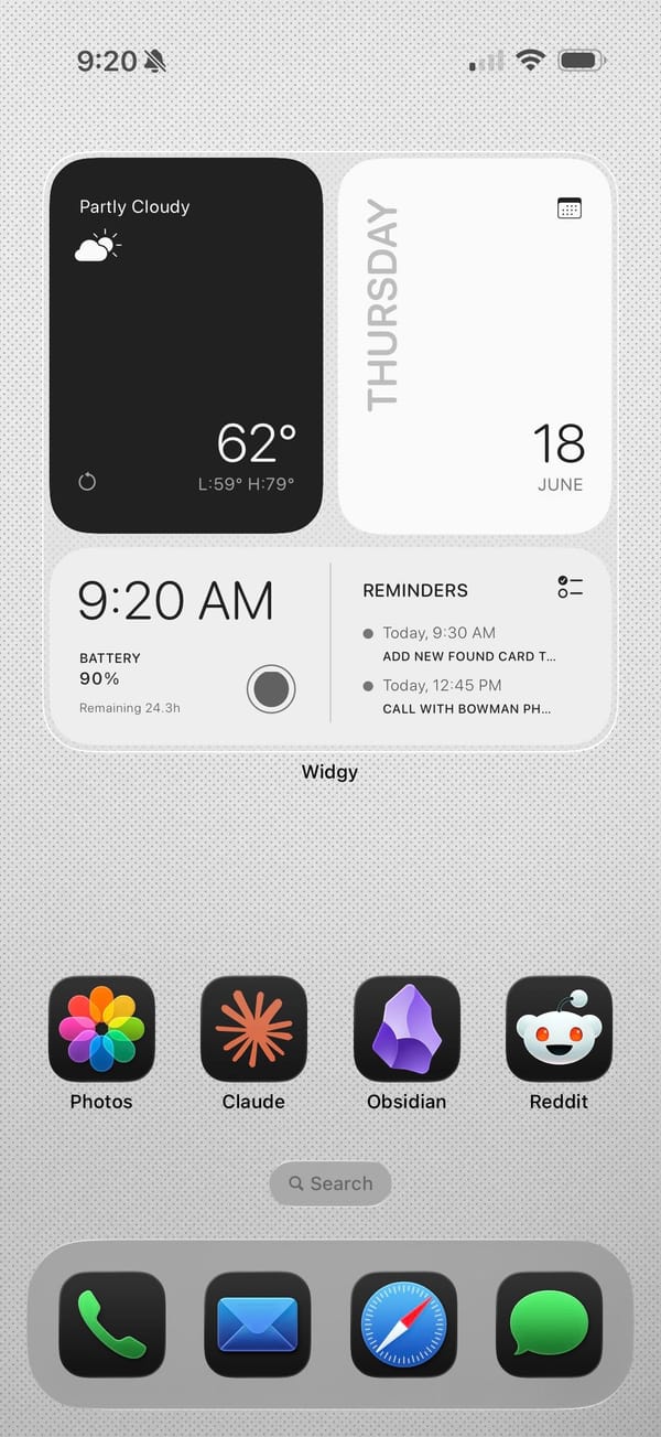
A productivity iPhoner keeps Obsidian, Claude, and Reddit one tap away, under Widgy widgets that turn a plain gray grid into a control panel.
For all of PetaPixel's praise of the Darkroom 7 engine, App Store reviewers since December count broken histograms and failed exports.
Finch's gentle accountability earns years-long streaks, but App Store reviewers describe streaks reset to 1 and a closet of bird clothes lost to a bug.

Even frozen since September 2023, Taio still holds up, with wikilinks, clipboard actions, and a JavaScript automation engine in one app.
Newsletter
Check your inbox
We've sent you a confirmation link.

Rush Rally Origins nails the slide through a dirty hairpin, a 36-stage overhead rally throwback that plays best with a controller.

Level Devil's traps are gleeful the first time through, but its App Store reviews report an ad after nearly every one of its bite-size levels.

Even with the cramped touch controls reviewers flag on iPhone, El Paso, Elsewhere keeps its slow-motion neo-noir shootouts mostly intact.
Streets of Rage 4 falls to $1.99 and Skul to $2.99 in the US App Store, part of a seven-game sale with every price checked live at publish time.

Dungeon of the Endless: Apogee falls to $0.99, Don't Starve matches it, and five more iPhone games land between $1.99 and $4.99, all verified live.