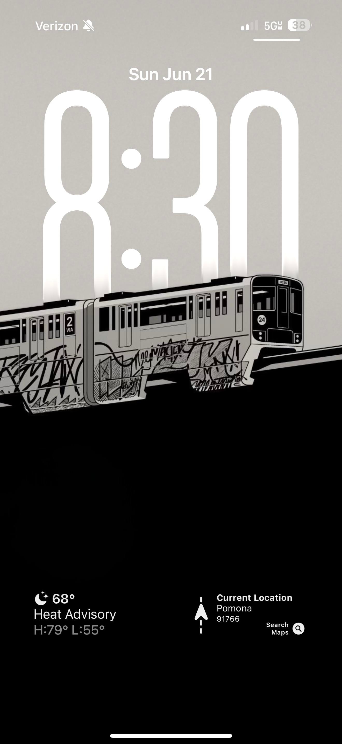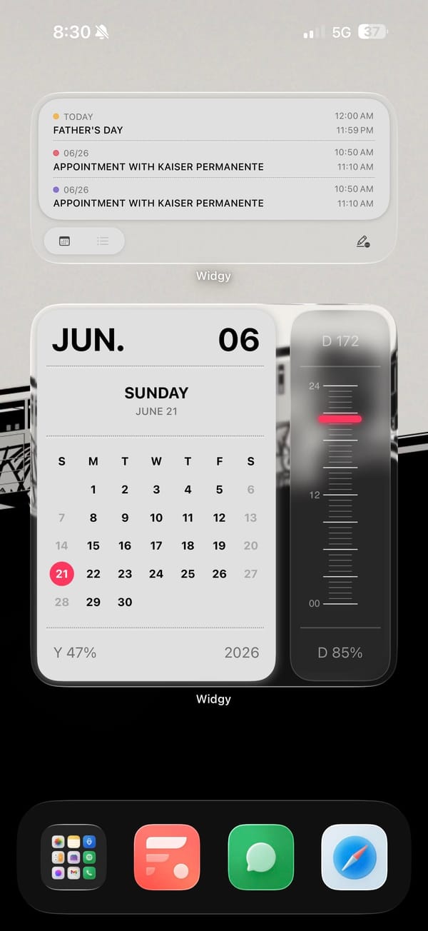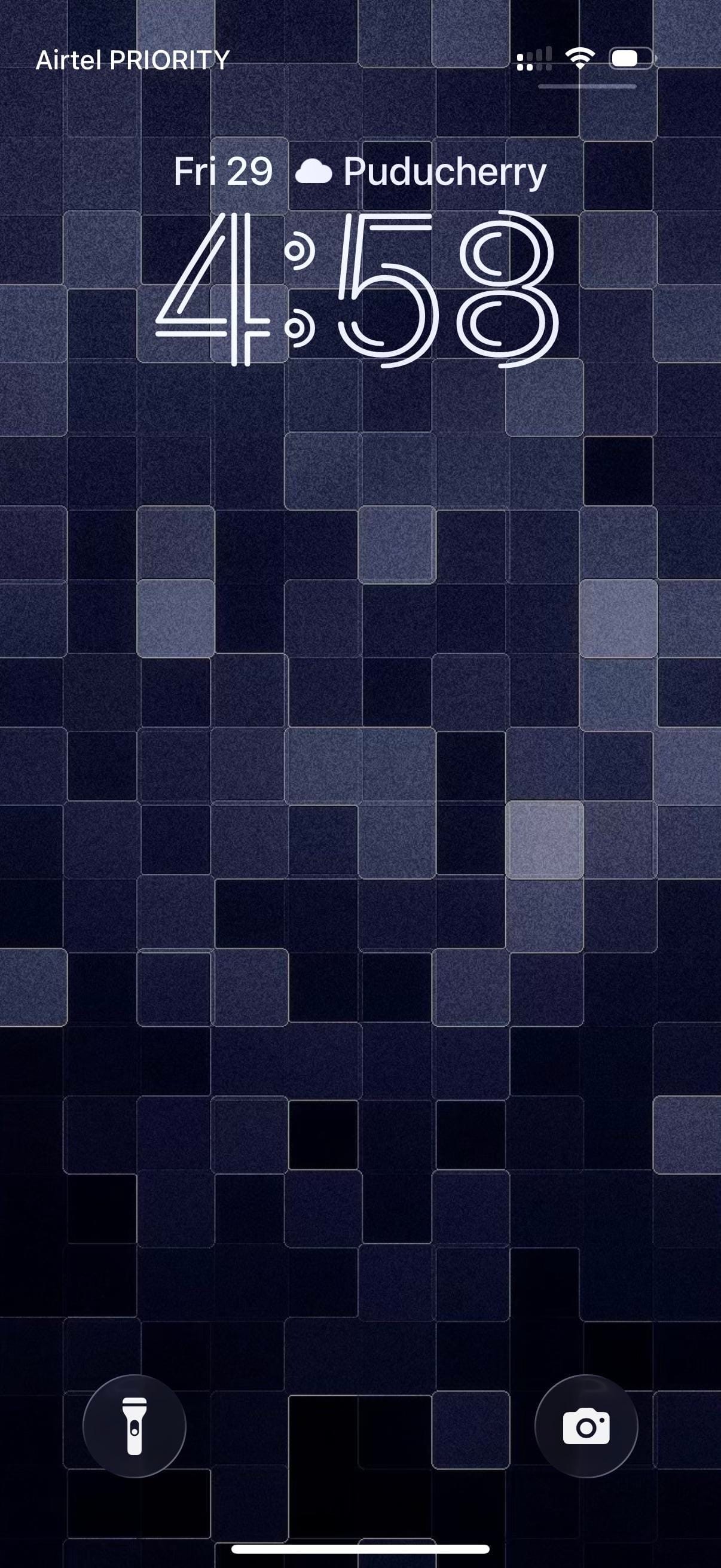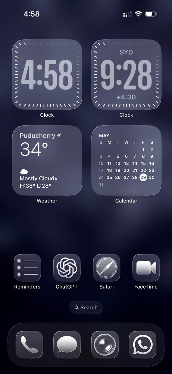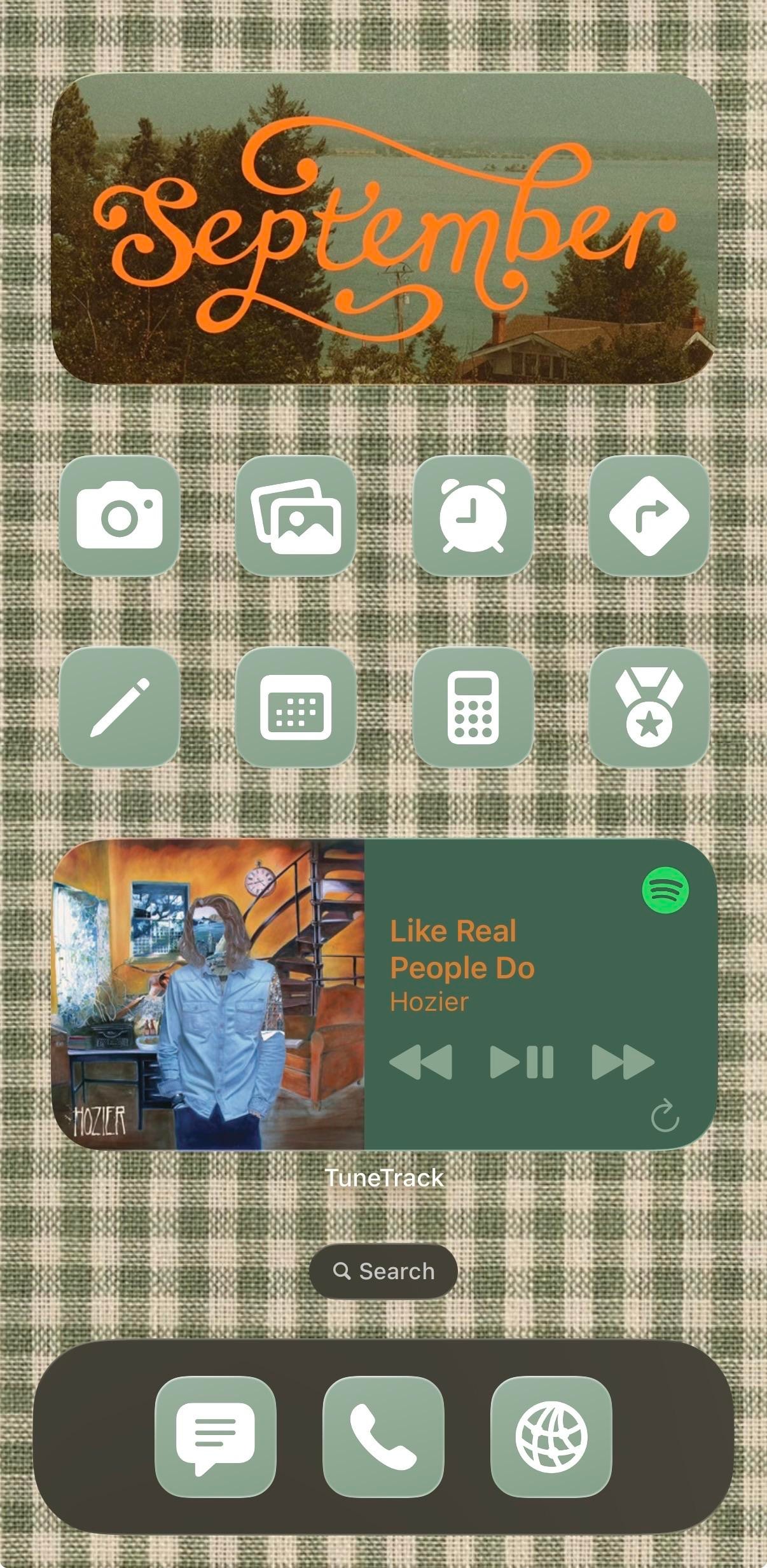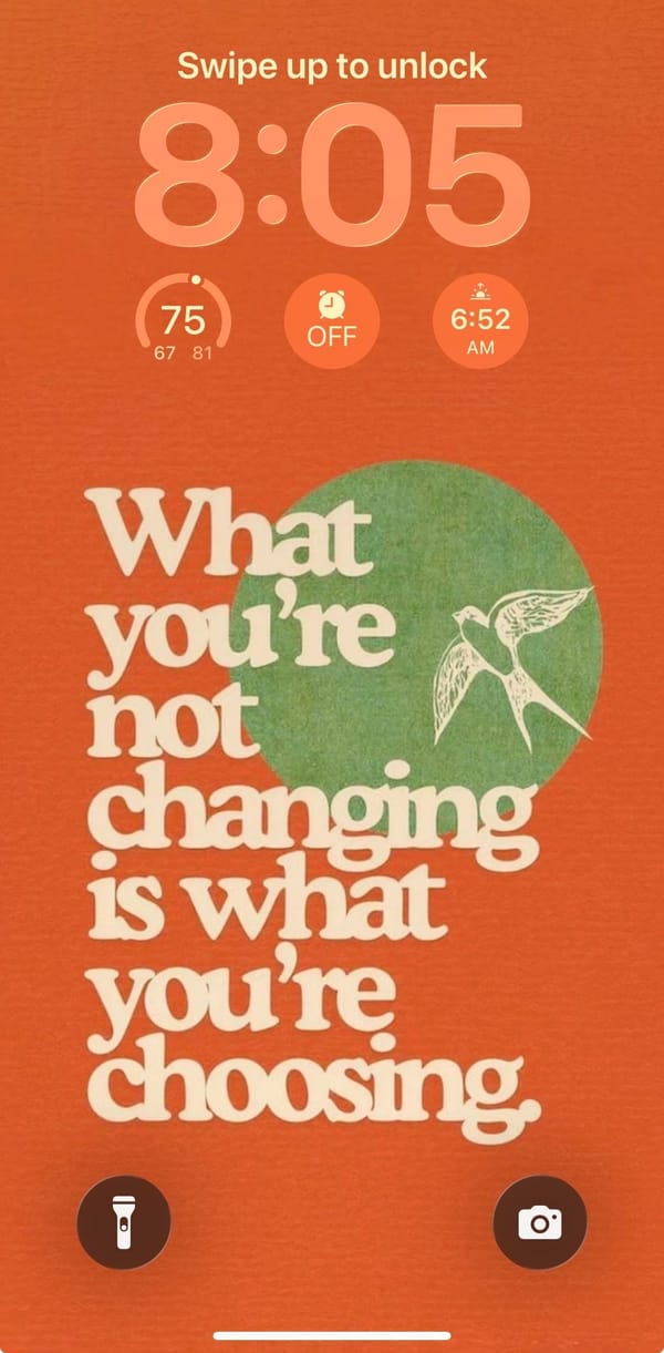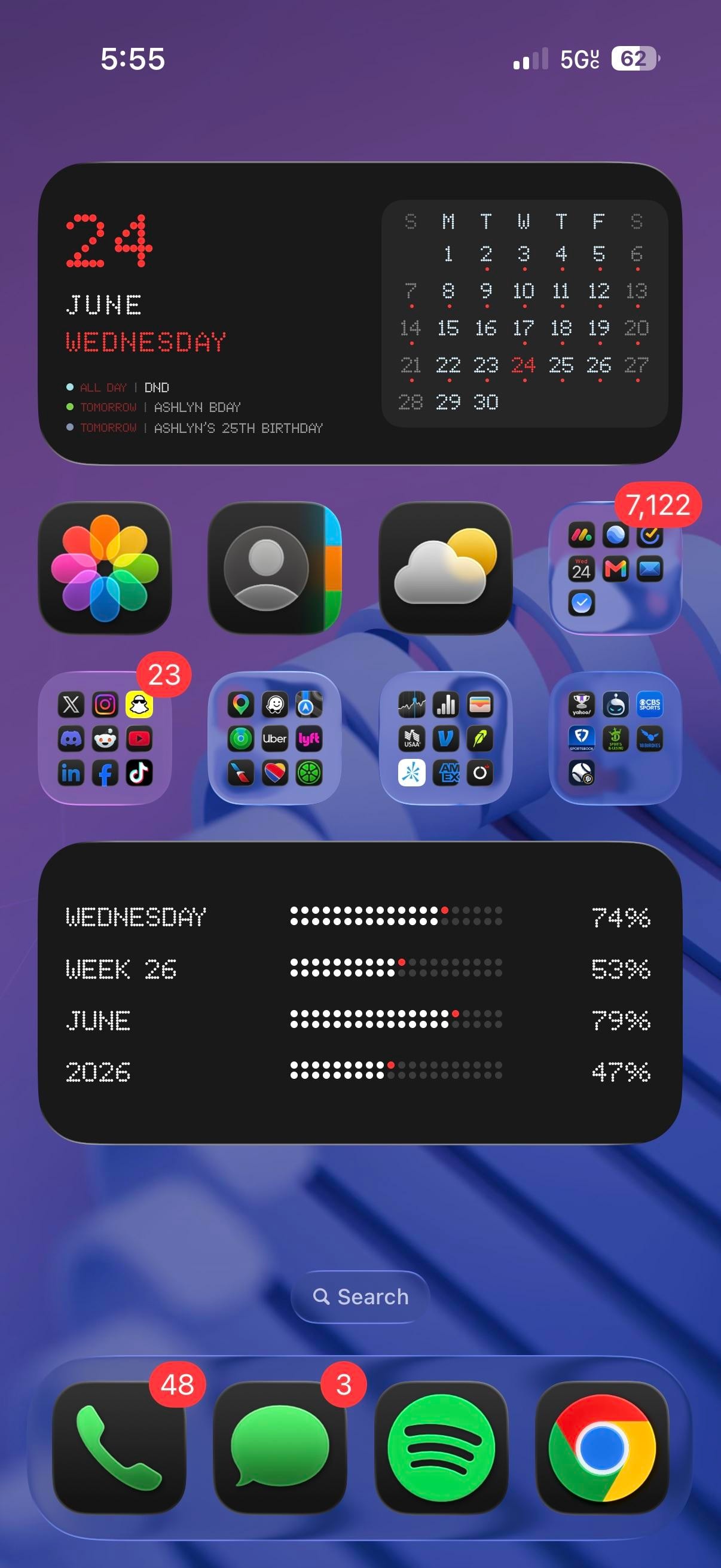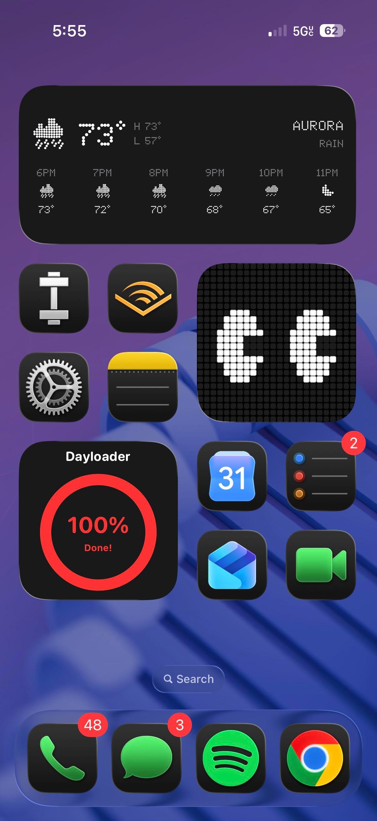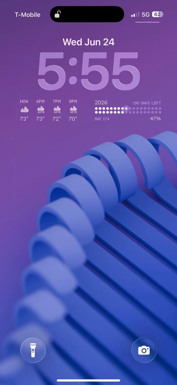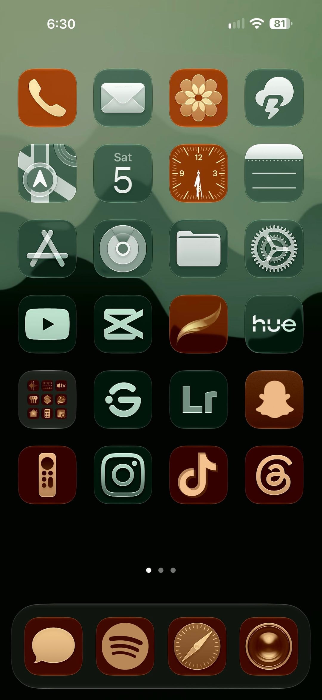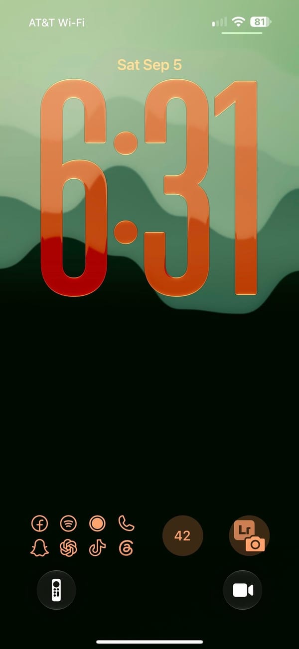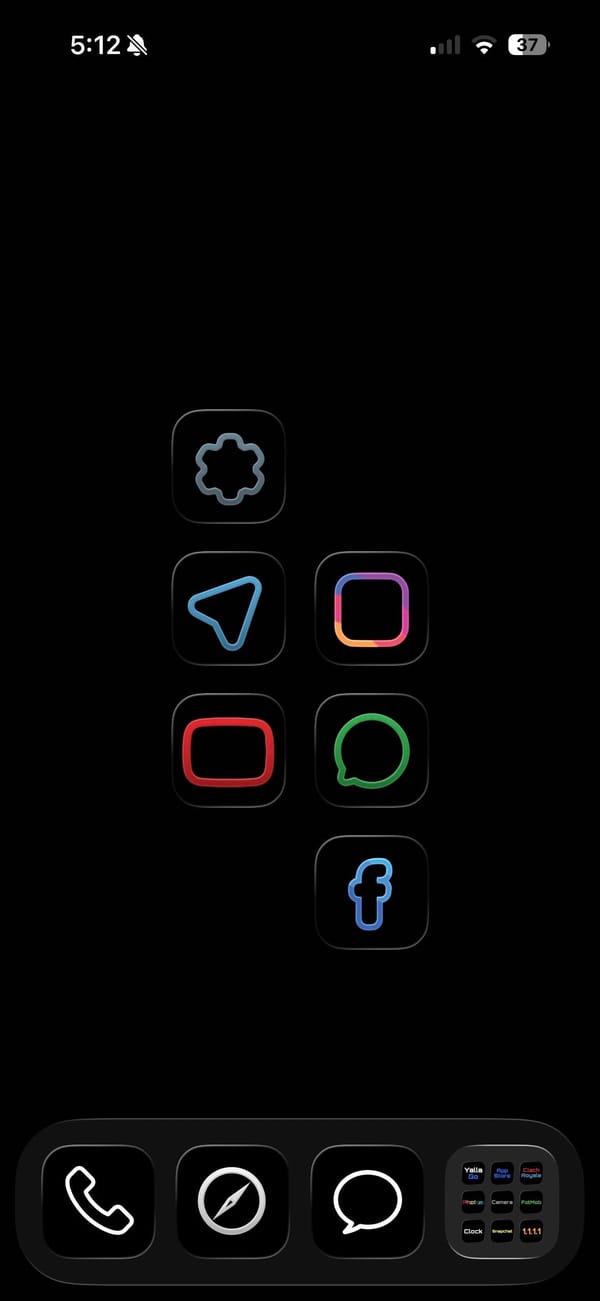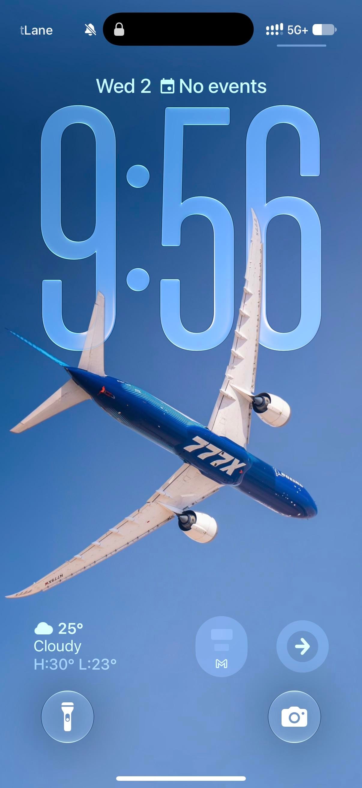
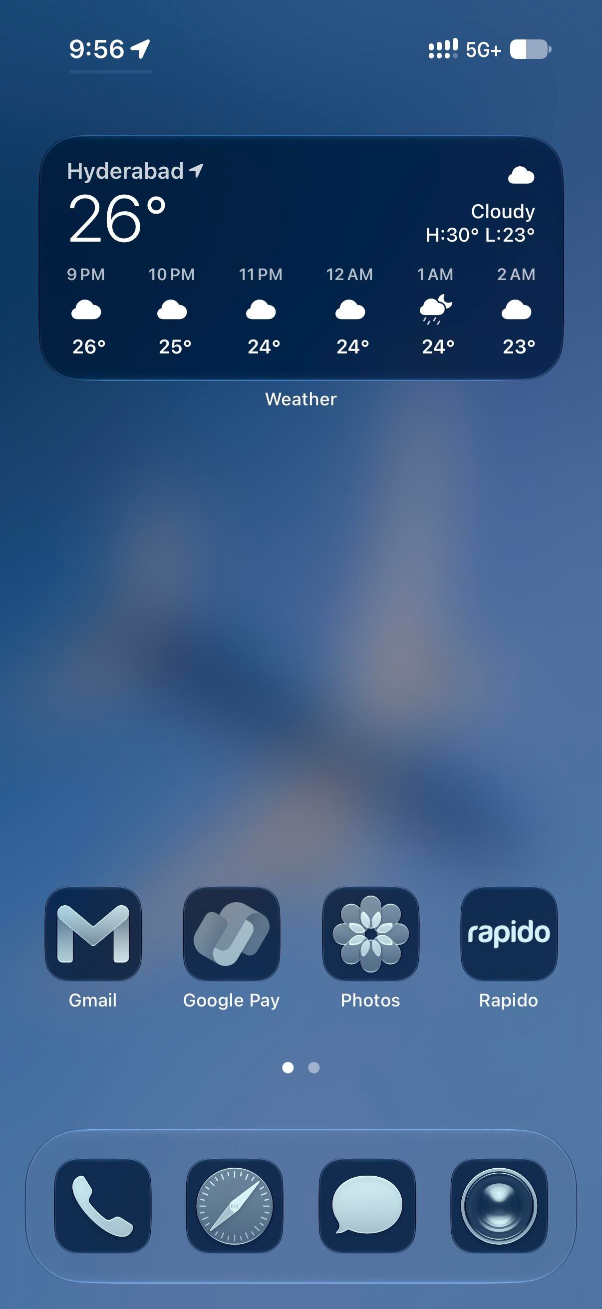
A Boeing 777X banks across a clear sky in the blue-and-white house livery. The clock sits behind it at the stretched size iOS 26 allows, glassy enough that the wing cuts in front of the last two digits. Everything after stays blue. The Home Screen blurs the plane into a gradient, and every icon takes the dark navy tint, Flightradar24 included, for a plane-spotting iPhoner running the whole phone in one hue.
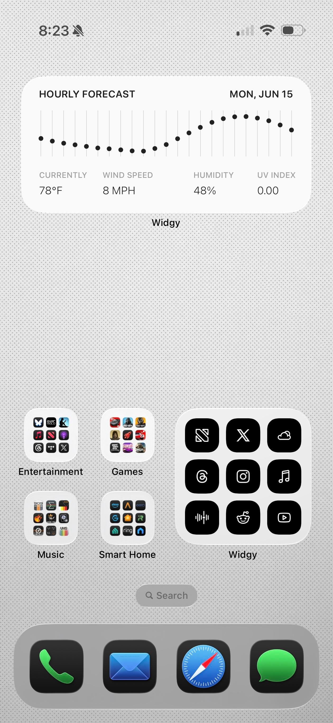
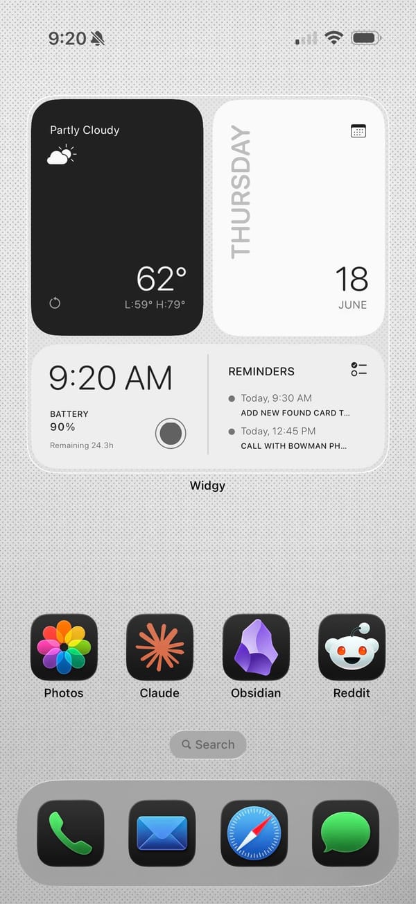
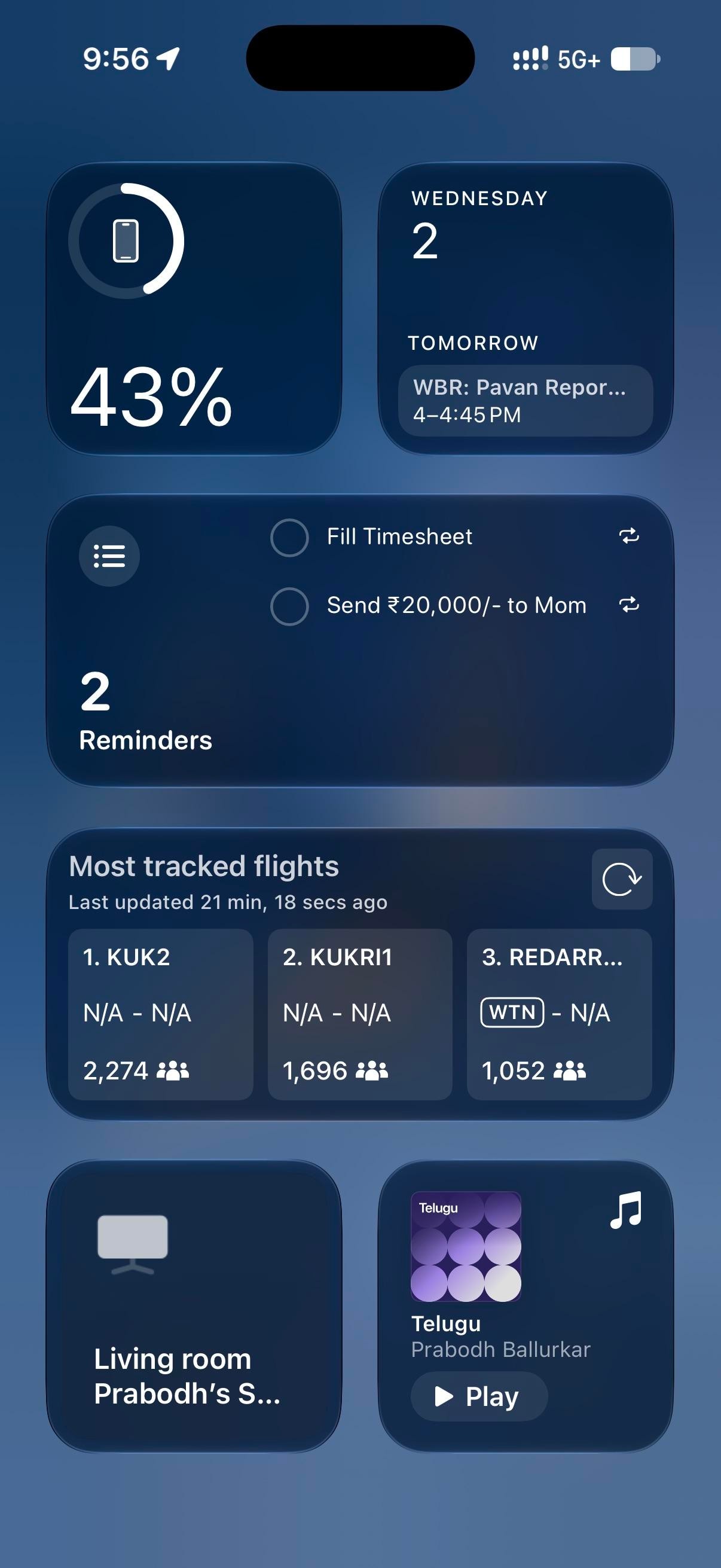
Page one holds a medium Weather widget and one row of four apps pushed down to the dock, leaving the blurred wing across the middle. Page two is denser: a medium Mail widget, small Google Maps and ChatGPT widgets, then eight apps in two rows. Today View, left of page one, is all widgets, led by Flightradar24's most-tracked-flights board over a Reminders list and a battery ring. The Lock Screen keeps its own widgets at the bottom edge, iOS 26 style: a weather readout and two round buttons, a Gmail M and a right-pointing arrow.
On this screen
- Flightradar24, the theme's second half, on page two and in Today View
- Google Maps, a small widget with the drive-home estimate
- ChatGPT, a small widget with Ask, camera, and voice
- RailOne and Rapido, trains and bike taxis, beside Google Pay on page one
- WhatsApp Business, Instagram, Discord, Netflix, YouTube, and VN on page two
The dock is stock, tinted with the rest: Phone, Safari, Messages, Camera.
Page one is the part to copy, with its four apps parked on the bottom row under a widget you read rather than tap. The tint itself is one switch in the Home Screen's Customize sheet, and to my eye it's a rare tinted setup where third-party icons hold up as well as Apple's.