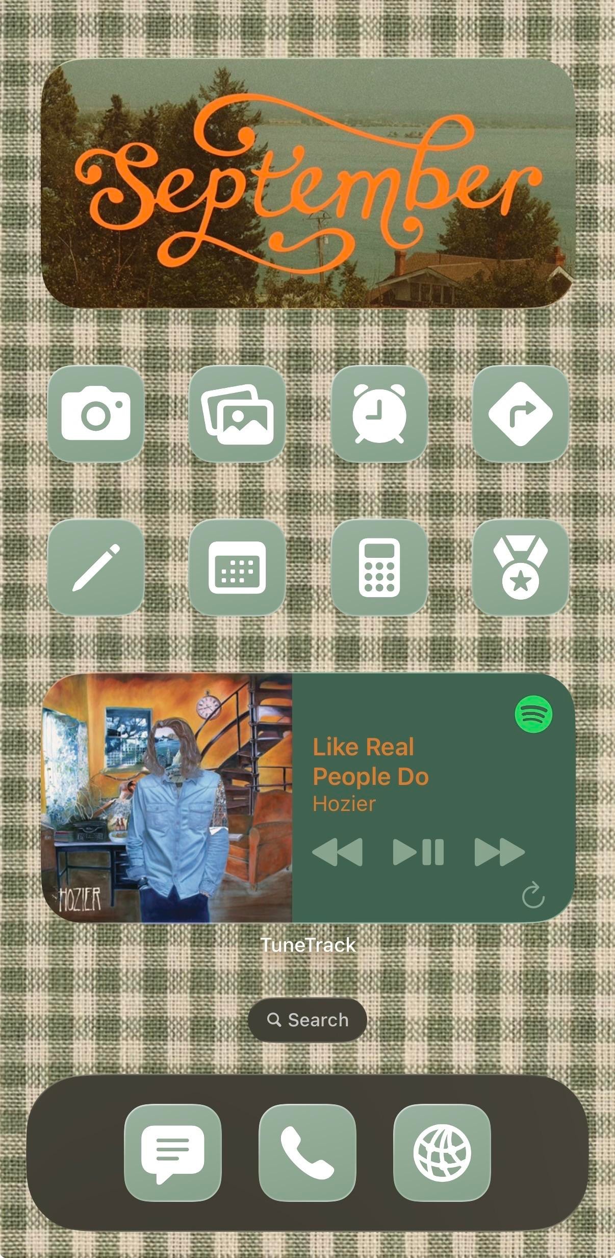
This phone has already decided it's autumn. The Lock Screen is a burnt-orange poster with a white swallow over a green circle and chunky retro serif reading "What you're not changing is what you're choosing," and the Home Screen answers it in sage-and-cream gingham, topped by a photo widget with September written across it in orange script. It belongs to a music-first iPhoner: the wallpapers don't match, the colors do.
The poster's green circle is the same sage as the icon tiles, and its cream lettering comes back in the gingham. Same three colors, two surfaces. Under the peach rounded clock sit three stock circle widgets for temperature, the next alarm, and sunrise. The Home Screen is one page: the medium photo widget with its faded lakeside shot, two rows of four icons, a medium now-playing card, and a dark olive dock. Every icon is the same sage square with a white glyph and no label. The grid reads as one block of color.
Five glyphs map to stock apps (camera, photo stack, alarm clock, calendar, calculator); the other three are a pencil, a turn arrow in a diamond, and a medal with a star. The centerpiece is TuneTrack, a third-party widget that mirrors Spotify's now-playing, and it's the only thing on the page that keeps its label. Hozier's "Like Real People Do" is on it, which suits the gingham a little too well. The dock holds a message bubble, a phone handset, and a globe in the same sage tiles.
Copying it costs a gingham image and a one-color icon set, then the discipline to stop at eight apps so the fabric has room to show. An iPhoner who gets that far can keep the widgets and should swap the quote, since that's the personal part of the build.
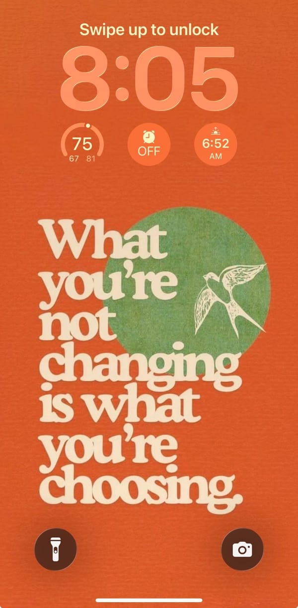
A gingham September home screen with Hozier in the middle
A music-first iPhoner's autumn build, with a retro poster quote on the Lock Screen and a gingham Home Screen that borrows its sage from the poster.